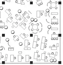
Office landscape (German: Bürolandschaft/Großraumbüro) was an early (1950s) movement in open plan office space planning that typically used irregular geometry and organic circulation patterns.
History
The general European mentality towards innovative forms of office design in the 1940 and 1950s was that of caution and hesitation following the devastating effects left from WWI and WWII. Before the 1950s, the majority of offices in Europe operated with closed-door offices and scaled-down versions of the massive bullpen offices that were found in skyscrapers across the U.S. But the postwar environment proved fertile to economic growth from massive amounts of reconstruction, and one country that had a particularly fast rate of growth was Germany. The quick emergence in manufacturing, paired with a new mentality of wanting to pave over their brutal past, left Germany open to new thinking. This openness led to the interjection of a concept that would quickly populate areas all over Europe and North America.
In 1958, the Quickborner consulting group was established by two brothers, Wolfgang and Eberhard Schnelle, who had previously been working as assistants in their father’s furniture studio. Upon founding Quickborner outside of Hamburg as a space planning firm, the two brothers soon developed an interest in office space. They saw the current status quo, which used versions of scientific management and consisted of uninspired rows of desks and a strict office hierarchy as an opportunity for change. They wanted to create a system where the individual is the focus, and rebel against the strict grid of corridors and desks with something organic and natural. Their approach was called Bürolandschaft, a German term that translates to “office landscape”.[1]
Social theory
The post-World War II social-democratic environment in many Northern European countries engendered an egalitarian management approach. Office landscape encouraged all levels of staff to sit together in one open floor to create a non-hierarchical environment that increased communication and collaboration.[2]
Typical designs and components
Typical designs used contemporary but conventional furniture which was available at the time. Standard desks and chairs were used, with lateral file cabinets, curved screens, and large potted plants used as visual barriers and space definers. Floor plans frequently used irregular geometry and organic circulation patterns to enhance the egalitarian nature of the plan. Many designs used slightly lower than normal occupancy density to mitigate the acoustical problems inherent in open designs.[3]
The seemingly random cluster of desks was done very intentionally and based on work paths and roles within the company. This flexibly made Bürolandschaft a very exciting option for companies, since it wasn’t “one size fits all”. Their approach to office design allowed for different spaces to be dealt with differently. The consistencies within this approach included an open plan, with no door to be closed or walls to split up space. An informal “break room” was also included in Bürolandschaft design, and they advocated for this informal space for coffee and leisure over the previous method of the Crystal Palace, where coffee carts were circulated at specific hours.[4]
Initial Reception
The first company to be commissioned by Quickborner was Bertelsmann, a German publishing company. They worked together for two years transforming the space into an appropriate solution. But once they did, other European companies began scrambling to transform their own offices to this new, open, human-centered alternative. “Within a few years, office landscapes were blooming in Sweden” as well as “across the English Channel and Atlantic”.[5]
A large pull for these adopters of Bürolandschaft was its affordability. Since no permanent partitions or walls needed to be constructed, the adaptable partitions made it very easy to deal with changes, whether it be upsizing or downsizing of employees.
Impact
An early advocate for Bürolandschaft in America was Robert Propst, who was hired as the head of the research wing of the furniture company Herman Miller 1958. He had been developing ideas of flexible office space design in the U.S around the same time as the Schnelle brothers in Germany. His concept was a flexible work environment known as Action Office that aimed to pair the adaptability and openness of Bürolandschaft with more privacy and personalization for employees.[6]
Aftermath
Office furniture companies quickly developed panel-hung systems and other types of systems furniture which sought to provide some of the advantages of office landscape, but with slightly greater privacy, density, and storage capacity.
Initially, the layouts typical of these systems imitated the irregular, organic forms of office landscape. However, Propst's Action Desk degenerated into the regimented sea of cubicles common in modern offices and reminiscent of earlier Taylorism due to standardization of parts in manufacturing and space efficiency. The sea of cubicles effectively replaced office landscape by the mid-1970s.
See also
- Quiet room, typically a room in an office built with regard to silence by shielding noise from or towards the surroundings
References
- ↑ Cubed by Nikil Saval | PenguinRandomHouse.com.
- ↑ Bürolandschaft
- ↑ "Changes in Employee Attitudes and Work Practices in an Office Landscape". Springer. Retrieved 4 April 2023.
- ↑ Cubed by Nikil Saval | PenguinRandomHouse.com.
- ↑ Cubed by Nikil Saval | PenguinRandomHouse.com.
- ↑ Cubed by Nikil Saval | PenguinRandomHouse.com.