The hamburger button (the triple bar ≡ or trigram symbol ☰), so named for its unintentional resemblance to a hamburger, is a button typically placed in a top corner of a graphical user interface.[1] Its function is to toggle a menu (sometimes referred to as a hamburger menu) or navigation bar between being collapsed behind the button or displayed on the screen. The icon which is associated with this widget, consisting of three horizontal bars, is also known as the collapsed menu icon.
History
Original design
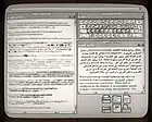
The icon was originally designed by Norm Cox as part of the user interface for the Xerox Star personal computer, introduced in 1981.[2] Cox described the icon's creation, saying, "Its graphic design was meant to be very 'road sign' simple, functionally memorable, and mimic the look of the resulting displayed menu list. With so few pixels to work with, it had to be very distinct, yet simple. I think we only had 16×16 pixels to render the image. (or possibly 13×13... can't remember exactly)."[3]
In mainstream desktop computing
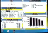
In possibly its first use after the Xerox Star, the release of Windows 1.0 in 1985 contained a hamburger icon in each window's control menu.[4] It was short-lived, however, as the hamburger icon disappeared in Windows 2.0 in favor of a single horizontal line denoting the control menu. Windows 95 replaced the single line with the program's icon,[5] and the hamburger would not return to Windows until a placement on the Start menu of the one-year update of Windows 10.[6]
Mobile usage
Cox's hamburger icon saw a resurgence starting in 2009 stemming from the limited screen area available to mobile apps.[7][8][9]
Appearance and functionality

The "menu" button takes the form of an icon that consists of three parallel horizontal lines (displayed as ≡), suggestive of a list.[7] The name refers to its resemblance to the menu that is typically exposed or opened when interacting with it.[10] The wider button may be reduced to three vertically stacked dots (displayed as a tri-colon or vertical ellipsis ⋮ ), also known as a kebab icon, meatball icon or falafel icon. In the Microsoft Office 365 platform, a similar application menu consisting of three rows of three squares is displayed.[11] Tapping, clicking or otherwise activating this button results in a menu being revealed, which distinguishes it from a menu or tab bar that is always on display.[12]
Reception
Appearance
It has been argued that while the collapsed menu button is now commonplace, its functionality is not necessarily immediately obvious when first encountered;[13] in particular, older users less familiar with modern iconography may find it confusing.[14] The location of the hamburger menu icon also depends on the specific website or app.[15]
Usability
The menu button may increase interaction cost compared to a menu bar, requiring extra clicks to retrieve the same information, albeit with the benefit of less space usage of the screen.[16] It has also been argued that designers tend to overload these icons with too much hidden information.[14]
See also
- Menu key
- Triple bar § Application design
- Ellipsis § Usage in computer system menus – used to indicate "More", or partially hidden options whereas the collapsed menu icon signify completely hidden options
References
- ↑ "How To Create a Menu Icon". www.w3schools.com. Archived from the original on 2018-09-05. Retrieved 2018-09-20.
- ↑ "The origin of the hamburger icon". Archived from the original on 2015-11-07. Retrieved 2018-09-20.
- ↑ "A Brief History of the Hamburger Icon". Placeit Blog. 2014-10-29. Retrieved 2019-02-23.
- ↑ Ali, Fahad (2015-05-13). "Microsoft First Used The Controversial Hamburger Menu In 1985". windowschimp.com. Archived from the original on 2021-04-01. Retrieved 2019-06-12.
- ↑ Doppelhammer, Jim. "Windows Elements". doublehammer.com. Retrieved 2019-06-12.
- ↑ Shaikh, Rafia (2016-04-04). "Here's How the New Windows 10 Anniversary Start Menu Looks Like". wccftech.com. Retrieved 2019-06-12.
- 1 2 Campbell-Dollaghan, Kelsey (March 31, 2014). "Who Designed the Hamburger Icon?". Gizmodo. Archived from the original on 2016-02-06. Retrieved February 2, 2016.
- ↑ "A Brief History of the Hamburger Icon". placeit.net. 29 October 2014. Archived from the original on 2017-02-02. Retrieved 25 January 2017.
- ↑ Ltd., Stuff & Nonsense (17 March 2012). "We need a standard show navigation icon for responsive web design". Archived from the original on 2018-09-20. Retrieved 2018-09-20.
- ↑ Lessin, Jessica (March 18, 2013). "What's a 'hamburger' button? A guide to app features". The Wall Street Journal. Dow Jones & Company. Archived from the original on 2015-04-16. Retrieved April 10, 2015.
- ↑ Nguyen, Chuong (June 26, 2015). "Office 365 Store saves time with single sign-on to web apps". Tech Radar Pro. Archived from the original on 2018-02-09. Retrieved 2018-02-08.
- ↑ Constine, Josh (May 24, 2014). "Kill the hamburger buttons". TechCrunch. Archived from the original on 2016-08-19. Retrieved April 10, 2015.
- ↑ Stokel-Walker, Chris (16 May 2015). "Hamburger icon: How these three lines mystify most people". BBC. Archived from the original on 2018-02-20. Retrieved 11 October 2018.
- 1 2 "Loving & Hating the Hamburger Icon". Webdesigner Depot. 2018-09-17. Retrieved 2019-02-23.
- ↑ Tsiodoulos, Dimitrios (2016). Comparison of hamburger and bottom bar menu on mobile devices for three level navigation (PDF) (Thesis). Archived (PDF) from the original on 2018-06-13. Retrieved 2018-06-13.
.jpg.webp)

