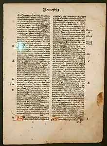
The canons of page construction are historical reconstructions, based on careful measurement of extant books and what is known of the mathematics and engineering methods of the time, of manuscript-framework methods that may have been used in Medieval- or Renaissance-era book design to divide a page into pleasing proportions. Since their popularization in the 20th century, these canons have influenced modern-day book design in the ways that page proportions, margins and type areas (print spaces) of books are constructed.
The notion of canons, or laws of form, of book page construction was popularized by Jan Tschichold in the mid to late twentieth century, based on the work of J. A. van de Graaf, Raúl Rosarivo, Hans Kayser, and others.[1] Tschichold wrote, "Though largely forgotten today, methods and rules upon which it is impossible to improve have been developed for centuries. To produce perfect books these rules have to be brought to life and applied." as cited in Hendel 1998, p. 7. Kayser's 1946 Ein harmonikaler Teilungskanon[2][3] had earlier used the term canon in this context.
Typographers and book designers are influenced by these principles to this day in page layout, with variations related to the availability of standardized paper sizes, and the diverse types of commercially printed books.[4]
Van de Graaf canon

The Van de Graaf canon is a historical reconstruction of a method that may have been used in book design to divide a page in pleasing proportions.[5] This canon is also known as the "secret canon" used in many medieval manuscripts and incunabula.
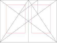
The geometrical solution of the construction of Van de Graaf's canon, which works for any page width:height ratio, enables the book designer to position the type area in a specific area of the page. Using the canon, the proportions are maintained while creating pleasing and functional margins of size 1/9 and 2/9 of the page size.[6] The resulting inner margin is one-half of the outer margin, and of proportions 2:3:4:6 (inner:top:outer:bottom) when the page proportion is 2:3 (more generally 1:R:2:2R for page proportion 1:R[7]). This method was discovered by Van de Graaf, and used by Tschichold and other contemporary designers; they speculate that it may be older.[8] The page proportions vary, but most commonly used is the 2:3 proportion. Tschichold writes "For purposes of better comparison I have based his figure on a page proportion of 2:3, which Van de Graaf does not use."[9] In this canon the type area and page size are of same proportions, and the height of the type area equals the page width. This canon was popularized by Jan Tschichold in his book The Form of the Book.[10]
Robert Bringhurst, in his The Elements of Typographic Style, asserts that the proportions that are useful for the shapes of pages are equally useful in shaping and positioning the textblock. This was often the case in medieval books, although later on in the Renaissance, typographers preferred to apply a more polyphonic page in which the proportions of page and textblock would differ.[11]
Golden canon


Tschichold's "golden canon of page construction"[10] is based on simple integer ratios, equivalent to Rosarivo's "typographical divine proportion".[12]
Interpretation of Rosarivo
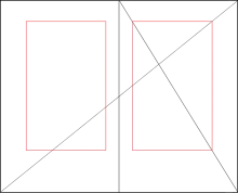
Raúl Rosarivo analyzed Renaissance-era books with the help of a drafting compass and a ruler, and concluded in his Divina proporción tipográfica ("Typographical Divine Proportion", first published in 1947) that Gutenberg, Peter Schöffer, Nicolaus Jenson and others had applied the golden canon of page construction in their works.[13] According to Rosarivo, his work and assertion that Gutenberg used the "golden number" 2:3, or "secret number" as he called it, to establish the harmonic relationships between the diverse parts of a work,[14] was analyzed by experts at the Gutenberg Museum and re-published in the Gutenberg-Jahrbuch, its official magazine.[15] Ros Vicente points out that Rosarivo "demonstrates that Gutenberg had a module different from the well-known one of Luca Pacioli" (the golden ratio).[15]
Tschichold also interprets Rosarivo's golden number as 2:3, saying:
In figure 5 the height of the type area equals the width of the page: using a page proportion of 2:3, a condition for this canon, we get one-ninth of the paper width for the inner margin, two-ninths for the outer or fore-edge margin, one-ninth of the paper height for the top, and two-ninths for the bottom margin. Type area and paper size are of equal proportions. ... What I uncovered as the canon of the manuscript writers, Raul Rosarivo proved to have been Gutenberg's canon as well. He finds the size and position of the type area by dividing the page diagonal into ninths.[9]
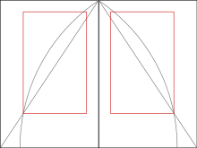
The figures he refers to are reproduced in combination here.
John Man's interpretation of Gutenberg
Historian John Man suggests that both the Gutenberg Bible's pages and printed area were based on the golden ratio (commonly approximated as the decimal 0.618 or the ratio 5:8).[16] He quotes the dimensions of Gutenberg's half-folio Bible page as 30.7 x 44.5 cm, a ratio of 0.690, close to Rosarivo's golden 2:3 (0.667) but not to the golden ratio (0.618).
Tschichold and the golden ratio
Building on Rosarivo's work, contemporary experts in book design such as Jan Tschichold and Richard Hendel assert as well that the page proportion of the golden ratio has been used in book design, in manuscripts, and incunabula, mostly in those produced between 1550 and 1770. Hendel writes that since Gutenberg's time, books have been most often printed in an upright position, that conform loosely, if not precisely, to the golden ratio.[17]

These page proportions based on the golden ratio, are usually described through its convergents such as 2:3, 3:5, 5:8, 8:13, 13:21, 21:34, etc.
Tschichold says that common ratios for page proportion used in book design include as 2:3, 1:√3, and the golden ratio. The image with circular arcs depicts the proportions in a medieval manuscript, that according to Tschichold feature a "Page proportion 2:3. Margin proportions 1:1:2:3. Type area in accord with the Golden Section. The lower outer corner of the type area is fixed by a diagonal as well."[18] By accord with the golden ratio, he does not mean exactly equal to, which would conflict with the stated proportions.
Tschichold refers to a construction equivalent to van de Graaf's or Rosarivo's with a 2:3 page ratio as "the Golden Canon of book page construction as it was used during late Gothic times by the finest of scribes." For the canon with the arc construction, which yields a type area ratio closer to the golden ratio, he says "I abstracted from manuscripts that are older yet. While beautiful, it would hardly be useful today."[19]
Of the different page proportions that such a canon can be applied to, he says "Book pages come in many proportions, i.e., relationships between width and height. Everybody knows, at least from hearsay, the proportion of the Golden Section, exactly 1:1.618. A ratio of 5:8 is no more than an approximation of the Golden Section. It would be difficult to maintain the same opinion about a ratio of 2:3."[20]
Tschichold also expresses a preference for certain ratios over others: "The geometrically definable irrational page proportions like 1:1.618 (Golden Section), 1:√2, 1:√3, 1:√5, 1:1.538, and the simple rational proportions of 1:2, 2:3, 5:8 and 5:9 I call clear, intentional and definite. All others are unclear and accidental ratios. The difference between a clear and an unclear ratio, though frequently slight, is noticeable… Many books show none of the clear proportions, but accidental ones."[21]
John Man's quoted Gutenberg page sizes are in a proportion not very close to the golden ratio,[22] but Rosarivo's or van de Graaf's construction is applied by Tschichold to make a pleasing type area on pages of arbitrary proportions, even such accidental ones.
Current applications
Richard Hendel, associate director of the University of North Carolina Press, describes book design as a craft with its own traditions and a relatively small body of accepted rules.[23] The dust cover of his book, On Book Design,[24] features the Van de Graaf canon.
Christopher Burke, in his book on German typographer Paul Renner, creator of the Futura typeface, described his views about page proportions:
Renner still championed the traditional proportions of margins, with the largest at the bottom of a page, 'because we hold the book by the lower margin when we take it in the hand and read it'. This indicates that he envisioned a small book, perhaps a novel, as his imagined model. Yet he struck a pragmatic note by adding that the traditional rule for margin proportions cannot be followed as a doctrine: for example, wide margins for pocket books would be counter-productive. Similarly, he refuted the notion that the type area must have the same proportions as the page: he preferred to trust visual judgment in assessing the placement of the type area on the page, instead of following a pre-determined doctrine.[25]
Bringhurst describes a book page as a tangible proportion, which together with the textblock produce an antiphonal geometry, which has the capability to bind the reader to the book, or conversely put the reader's nerve on edge or drive the reader away.[26]
See also
References
- ↑ Tschichold 1991, p. 46.
- ↑ Kayser 1946.
- ↑ Anon. n.d.
- ↑ Egger 2004, p. 52.
- ↑ Graaf van de 1946: as cited by Tschichold and others; original not examined
- ↑ Tschichold 1991, pp. 28, 37, 48, 51, 58, 61, 138, 167, 174.
- ↑ Max 2010, pp. 137–141.
- ↑ Hurlburt 1982, p. 71.
- 1 2 3 Tschichold 1991, p. 45.
- 1 2 Tschichold 1991.
- ↑ Bringhurst 1999, p. 163.
- ↑ Rosarivo 1953, p. 1.
- ↑ Carreras.
- ↑ Rosarivo 1953" [...] el número de oro o número clave en que Gutenberg se basó para establecer las relaciones armónicas que guardan las diversas partes de una obra"
- 1 2 Vicente 2004, p. 41-61.
- ↑ Man 2002, pp. 166–67:"The half-folio page (30.7 x 44.5 cm) was made up of two rectangles—the whole page and its type area—based on the so called 'golden section', which specifies a crucial relationship between short and long sides, and produces an irrational number, as pi is, but is a ratio of about 5:8 (footnote: The ratio is 0.618.... ad inf commonly rounded to 0.625)"
- ↑ Hendel 1998, p. 34.
- ↑ Tschichold 1991, p. 43, Fig 4: "Framework of ideal proportions in a medieval manuscript without multiple columns. Determined by Jan Tschichold 1953. Page proportion 2:3, margin proportions 1:1:2:3, type area proportioned in the Golden Section. The lower outer corner of the type area is fixed by a diagonal as well." (in the Dutch version, "letterveld volgens de Gulden Snede"—type area in accord with the Golden Section
- ↑ Tschichold 1991, p. 44.
- ↑ Tschichold 1991, p. 37.
- ↑ Tschichold 1991, pp. 37–38.
- ↑ Man 2002.
- ↑ Hendel 1998, pp. 1–5.
- ↑ Hendel 1998.
- ↑ Burke 1998.
- ↑ Bringhurst 1999, p. 145.
Sources
- Anon. (n.d.). "Writings on Villard de Honnecourt, 1900-1949". Archived from the original on 2006-09-27.
An article-length (p. 32) attempt to demonstrate the use of Pythagorian musical proportion as the basis for the geometry in three of Villard's figures: fol. 18r, two figures at the bottom; and fol. 19r, rightmost figure in the second row from the top. While the geometric design itself is unquestionably that generated from the Pythagorian monochord, Kayser does not convince the reader that Villard understood its musical basis. Kayser apparently worked from photographs of the original folios, and the significance of Kayser's claim may be summarized in his own admission (p.30) that Villard's geometry does not match that of the Pythagorean design when correctly drawn.
- Bringhurst, Robert (1999). The elements of typographic style. Point Roberts, WA: Hartley & Marks. ISBN 978-0-88179-132-7.
- Burke, Christopher (1998). Paul Renner : The Art of Typography. New York: Princeton Architectural Press. ISBN 978-1-56898-158-1.
- Carreras, Fabián, Rosarivo 1903 - 2003, archived from the original on 2007-10-21, retrieved 2008-03-16
- Egger, Willi (2004). "Help! The Typesetting Area" (PDF). Maps. De Nederlandstalige TeX Gebruikersgroep. 30. shows the Van de Graaf canon and a variant that divides the page into twelfths)
- Graaf van de, J. A. (November 1946). "Nieuwe berekening voor de vormgeving" [A new calculation for giving form]. Tété: Technisch Tijdschrift voor de Grafische Industrie (in Dutch). Amsterdam: 95–100.
- Hendel, Richard (1998). On Book Design. Yale University Press. ISBN 978-0-300-07570-0.
- Hurlburt, Allen (1982). Grid: A Modular System for the Design and Production of Newspapers, Magazines, and Books. New York: Wiley. ISBN 978-0-471-28923-4.
- Kayser, Hans (1946). Ein harmonikaler Teilungskanon: Analyse einer geometrischen Figur im Bauhüttenbuch Villard de Honnecourt [A canon for harmonious page division: analysis of a geometric figure in Bauhaus book of Villard de Honnecourt] (in German). Zurich: Occident-Verlag.
- Man, John (2002). Gutenberg: How One Man Remade the World with Words. Wiley. ISBN 978-0-471-21823-4.
- Max, Stanley M. (2010). "The 'Golden Canon' of book-page construction: proving the proportions geometrically". Journal of Mathematics and the Arts. 4 (3): 137–141. doi:10.1080/17513470903458205. ISSN 1751-3472. S2CID 123606086.
- Rosarivo, Raúl M. (1953). Divina proporción tipográfica [Divine typographic proportions] (in Spanish). La Plata, Argentina: Ministry of Education of the Province of Buenos Aires.
- Tschichold, Jan (1991). The Form of the Book: Essays on the Morality of Good Design. Hartley & Marks. ISBN 978-0-88179-116-7.
- Vicente, Ros (2004). "Raúl Mario Rosarivo o el amor al libro" (PDF). Infodiversidad (in Spanish). Argentina: Sociedad de Investigaciones Bibilotecológicas. 7. ISSN 1514-514X. Archived (PDF) from the original on 2008-03-07.
Further reading
- Elam, Kimberly (2001). Geometry of Design: Studies in Proportion and Composition. Princeton Architectural Press. ISBN 978-1-56898-249-6.
- Luca Pacioli, De Divina Proportione (1509)
- Lehmann-Haupt, Hellmut (1931). Five Centuries of Book Design: A Survey of Styles in the Columbia Library. Columbia University.
- Prieto, Ana Belén Sánchez (26 December 2012). "La geometría del códice y su semiótica". Eikón / Imago. 1 (2): 131–152. doi:10.5209/eiko.73354.
- Raúl Rosarivo. Divina proporción tipográfica
- "Divina proporción tipográfica". Rosarivo.com.ar (in Spanish). Archived from the original on 2010-03-18.
- "La divina proporción tipográfica". FabianCarreras.com.ar (in Spanish). Archived from the original on 2007-10-11. (Brief discussion about his work)
External links
- "A Tribute to Richard Eckersley: British-born Book Designer". Archived from the original on 2010-01-11. Retrieved 2008-01-30.
- Charchar, Alex. "The Secret Law of Page Harmony". Retinart. Archived from the original on February 6, 2023. Retrieved 17 April 2023.