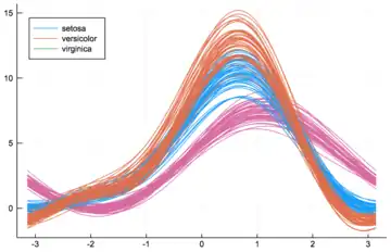
In data visualization, an Andrews plot or Andrews curve is a way to visualize structure in high-dimensional data. It is basically a rolled-down, non-integer version of the Kent–Kiviat radar m chart, or a smoothed version of a parallel coordinate plot. It is named after the statistician David F. Andrews.[1][2][3][4]
A value is a high-dimensional datapoint if it is an element of . We can represent high-dimensional data with a number for each of their dimensions, . To visualize them, the Andrews plot defines a finite Fourier series:
This function is then plotted for . Thus each data point may be viewed as a line between and . This formula can be thought of as the projection of the data point onto the vector:
If there is structure in the data, it may be visible in the Andrews curves of the data.
These curves have been utilized in fields as different as biology, neurology, sociology and semiconductor manufacturing. Some of their uses include the quality control of products, the detection of period and outliers in time series, the visualization of learning in artificial neural networks, and correspondence analysis.
Theoretically, it is possible to project them onto an n-sphere. The projection onto the circle results in the aforementioned radar chart.
References
- ↑ Andrews, D. F. (1972). "Plots of High-Dimensional Data". Biometrics. 28 (1): 125–136. doi:10.2307/2528964. JSTOR 2528964.
- ↑ Embrechts, Paul; Herzberg, Agnes M. (1991). "Variations of Andrews' Plots". International Statistical Review / Revue Internationale de Statistique. 59 (2): 175–194. doi:10.2307/1403442. ISSN 0306-7734. JSTOR 1403442.
- ↑ García-Osorio, César; Fyfe, Colin (2005). "Visualization of High-Dimensional Data via Orthogonal Curves" (PDF). Journal of Universal Computer Science. 11 (11): 1806–1819.
- ↑ "Andrews Curves". Rip’s Applied Mathematics Blog. 3 October 2011.