 | |
| Category | Sans-serif |
|---|---|
| Designer(s) | Matthew Carter |
| Foundry | Monotype |
| Date released | 2011 |
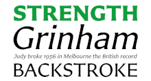
Carter Sans is a typeface by Matthew Carter, in collaboration with Dan Reynolds.[1][2] In style, it is described as a "hybrid sans-serif" or "humanist stressed sans" ("flare serif", "glyphic serif"), as it does not have serifs, but letters do flare slightly near the ends of strokes, which is particularly notable in the capitals. This is a relatively rarer style, and Carter states that he was particularly influenced by Albertus (1932–40) by Berthold Wolpe, also of Monotype.[3]
It is the first of his designs to bear his name, and was based on a commission by Alan Haley of Monotype to develop a sans-serif based on Carter's ITC Charter, though development ultimately took a different turn.
The font was unveiled in a preview on November 4, 2010, at the Art Directors Club 2010 Hall of Fame gala, and was released in January 2011.
The capitals are given particular focus, and in demonstrations it has been used to set passages in all caps, though a full suite (lower case, italics, bold, etc.) is available.
References
- ↑ Ford, Colin M. "Carter Sans". Typographica. Retrieved 6 November 2016.
- ↑ Reynolds, Dan (18 January 2011). "Carter Sans". Typeoff. Retrieved 6 November 2016.
- ↑ Shaw, Paul (2 March 2011). "An Interview With Matthew Carter". Print magazine. Retrieved 6 November 2016.
External links
- Carter Sans – home page
- New Work: Art Directors Club Hall of Fame Gala
- Graphic Content: Carter Sans, by Steven Heller, New York Times, February 2, 2011