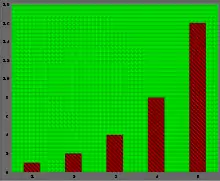
Chartjunk consists of all visual elements in charts and graphs that are not necessary to comprehend the information represented on the graph, or that distract the viewer from this information.[1][2][3]
Markings and visual elements can be called chartjunk if they are not part of the minimum set of visuals necessary to communicate the information understandably. Examples of unnecessary elements that might be called chartjunk include heavy or dark grid lines, unnecessary text, inappropriately complex or gimmicky font faces, ornamented chart axes, and display frames, pictures, backgrounds or icons within data graphs, ornamental shading and unnecessary dimensions.
Another kind of chartjunk skews the depiction and makes it difficult to understand the real data being displayed. Examples of this type include items depicted out of scale to one another, noisy backgrounds making comparison between elements difficult in a chart or graph, and 3-D simulations in line and bar charts.

The term chartjunk was coined by Edward Tufte in his 1983 book The Visual Display of Quantitative Information.[1] Tufte wrote:
The interior decoration of graphics generates a lot of ink that does not tell the viewer anything new. The purpose of decoration varies—to make the graphic appear more scientific and precise, to enliven the display, to give the designer an opportunity to exercise artistic skills. Regardless of its cause, it is all non-data-ink or redundant data-ink, and it is often chartjunk.
The term is relatively recent and is often associated with Tufte in other references.[2][4]
The concept is analogous to Adolf Loos's idea that ornament is a crime.
Etymology
The term chartjunk was first coined by Edward Tufte in 1983.[1] The book was developed based on ideas and materials developed for a Princeton statistics course that Tufte co-taught with John Tukey. As a self-published book, The Visual Display of Quantitative Information, Tufte claims that good design is founded in minimalist design principles. Specifically, he states that "graphics reveal data"[1] if they are designed with "graphical integrity."[1] Tufte, through minimalist design principles, was committed to an objective and neutral values of science. Other researchers have argued that minimalism is not objective and is full of its own rhetoric and potential to bias.[5][6]
Tufte, in coining the term chartjunk, also made direct comments about a well-known designer at that time, Nigel Holmes.
Nearly all those who produce graphics for mass publication are trained exclusively in the fine arts and have had little experience with the analysis of data. Such experiences are essential for achieving precision and grace in the presence of statistics... Those who get ahead are those who beautified data, never mind statistical integrity."[1]
Further, in his second published book, Envisioning Information,[7] Tufte critiques Holmes' Diamonds chart:[8]
"Consider this unsavory exhibit at right – chockablock with cliché and stereotype, coarse humor, and a content-empty third dimension... Credibility vanishes in clouds of chartjunk; who would trust a chart that looks like a video game?"
In a 1992 New York Times article, the reporter captures Holmes' response to Tufte's criticism:[9]
"Time's Nigel Holmes, creator of the diamonds graph, was understandably irked when Tufte criticized it. Holmes admits his work has sometimes been exaggerated, but feels that Tufte, in his insistence on absolute mathematical fidelity, remains trapped in ’the world of academia’ and insensitive to ’the world of commerce,’ with its need to grab an audience"
This debate between Tufte and Holmes is emblematic of the tension between statistical and designerly approaches to visualization design.[5][10][11]
Debate over meaning
The term chartjunk is an umbrella term that can be used to describe a variety of visual devices and has been referenced by different terms across research.
| Term | Citation |
|---|---|
| embellishment | [5][12] |
| excessive annotation | [13] |
| decoration | [13] |
| extraneous elements | [6] |
| unnecessary ornamentation | [6] |
Stephen Few, a data visualization practitioner and consultant at Perceptual Edge, stated that Tufte's original definition of chartjunk was "too loose" and that "by defining chartjunk too broadly, Tufte to some degree invited the heated controversy that has raged ever since."[10]
Robert Kosara, also a data visualization practitioner, researcher, and author of the blog EagerEyes, noted that not all chartjunk are the same, some are harmful (e.g. a busy background), others harmless (e.g. nice borders or pictures), and some even helpful (e.g. annotations).[14]
In a recent study by Parsons and Shukla,[11] they interviewed data visualization designers and found that there is both a "corrective movement" in the design community to move away from minimalist design principles, but also, that designers had different definitions for what constitutes chartjunk. The authors felt that "better definitions are needed so that everyone has a shared understanding [about chartjunk]."
Chartjunk in research
The information visualization research community has researched the effects of chartjunk on how viewers interpret visualizations. There have been studies that found that chartjunk increases long-term memorability of the chart.[5][13] A recent study[12] found that chartjunk, in the form of semantically meaningful icons, increased accessibility of charts for people with Intellectual and Developmental Disabilities (IDD).
See also
References
- 1 2 3 4 5 6 Tufte, Edward R. (1983). The Visual Display of Quantitative Information. Cheshire, CT: Graphics Press.
- 1 2 Harris, Robert L. (1999). Information Graphics: A Comprehensive Illustrated Reference. USA: Oxford University Press. p. 72. ISBN 0-19-513532-6.
- ↑ Tufte, Edward R. (2006). Beautiful Evidence. Cheshire, CT: Graphics Press. pp. 152–53. ISBN 978-0961392178.
- ↑ Cleveland, William S. (1985). The Elements of Graphing Data. Pacific Grove, CA: Wadsworth & Advanced Book Program. p. 25. ISBN 0-534-03730-5.
- 1 2 3 4 Bateman, Scott; Mandryk, Regan L.; Gutwin, Carl; Genest, Aaron; McDine, David; Brooks, Christopher (2010). "Useful junk?". Proceedings of the SIGCHI Conference on Human Factors in Computing Systems. Atlanta, Georgia, USA: ACM Press. pp. 2573–2582. doi:10.1145/1753326.1753716. ISBN 978-1-60558-929-9. S2CID 195346232.
- 1 2 3 Kennedy, Helen; Hill, Rosemary Lucy; Aiello, Giorgia; Allen, William (2016-03-16). "The work that visualisation conventions do". Information, Communication & Society. 19 (6): 715–735. doi:10.1080/1369118x.2016.1153126. ISSN 1369-118X. S2CID 61550176.
- ↑ Tufte, Edward R. (1990). Envisioning information. Graphics Press. ISBN 978-1-930824-14-0. OCLC 1135806416.
- ↑ Bailey, Jefferson; Pregill, Lily (September 2014). "Speak to the Eyes: The History and Practice of Information Visualization". Art Documentation: Journal of the Art Libraries Society of North America. 33 (2): 168–191. doi:10.1086/678525. ISSN 0730-7187. S2CID 62223240.
- ↑ Patton, Phil (1992-01-19). "UP FROM FLATLAND". The New York Times. ISSN 0362-4331. Retrieved 2021-08-01.
- 1 2 Few, Stephen. "The Chartjunk Debate: A Close Examination of Recent Findings" (PDF). Perceptual Edge. Archived (PDF) from the original on 2011-05-21. Retrieved July 31, 2021.
- 1 2 Parsons, Paul; Shukla, Prakash (October 2020). "Data Visualization Practitioners' Perspectives on Chartjunk". 2020 IEEE Visualization Conference (VIS). Salt Lake City, UT, USA: IEEE. pp. 211–215. arXiv:2009.02634. doi:10.1109/VIS47514.2020.00049. ISBN 978-1-7281-8014-4. S2CID 221516843.
- 1 2 Wu, Keke; Petersen, Emma; Ahmad, Tahmina; Burlinson, David; Tanis, Shea; Szafir, Danielle Albers (2021-05-06). "Understanding Data Accessibility for People with Intellectual and Developmental Disabilities". Proceedings of the 2021 CHI Conference on Human Factors in Computing Systems. New York, NY, USA: ACM. pp. 1–16. doi:10.1145/3411764.3445743. ISBN 978-1-4503-8096-6. S2CID 233987580.
- 1 2 3 Borkin, Michelle A.; Vo, Azalea A.; Bylinskii, Zoya; Isola, Phillip; Sunkavalli, Shashank; Oliva, Aude; Pfister, Hanspeter (December 2013). "What Makes a Visualization Memorable?". IEEE Transactions on Visualization and Computer Graphics. 19 (12): 2306–2315. doi:10.1109/TVCG.2013.234. ISSN 1077-2626. PMID 24051797. S2CID 2936091.
- ↑ "The Three Types of Chart Junk". eagereyes. 2012-03-05. Retrieved 2021-08-01.