

Christoffel van Dijck (c. 1600-5, Dexheim – November 1669, Amsterdam)[lower-alpha 1] was a German-born Dutch punchcutter and typefounder, who cut punches and operated a foundry for casting metal type. Van Dijck's type was widely used at a time when Amsterdam had become a major centre of world printing.[3][4][5][6]
Life

Van Dijck was born in Dexheim, now in Germany, to a Dutch Protestant family.[7][8] His father Gilbert Breberenus van den Dijck and half-brother Johannes were Calvinist ministers.[8][9] Gilbert had come to Dexheim from Breberen (in the United Duchies of Jülich-Cleves-Berg).[10] Christoffel was trained as a goldsmith.[11][9] By 1640 he moved to Amsterdam as a journeyman.[8][12] On 11 October 1642 he applied to marry Swaentje Harmens (c. 1600/1601 – 1668)[13] from Nordhorn, the widow of former minister Jan de Praet.[14][13]
Van Dijck then changed career to become a specialist in cutting steel punches, the masters used to stamp matrices, the moulds used to cast a letterform in metal type.[lower-alpha 2] How he began this career change is not documented; John A. Lane, a historian of printing in the Netherlands and expert on van Dijck's career, speculates that he may have begun by cutting types for other typefounders.[12] In 1647 he rented a house on the Bloemgracht in which he set up a type foundry.[7][12][15] This was close to the printing office of his client Joan Blaeu.[12] By the end of his career his foundry was based on Elandsstraat.[16][17] He died in November 1669 and was buried in the nearby Westerkerk.[17] His near contemporary Rembrandt had been buried there the previous month.[18]
Career
Van Dijck became the most prominent type-founder of his time in the Netherlands,[8] cutting type in roman, italic, blackletter,[19] Armenian,[11] music type,[20] and probably printers' flowers.[21] In or shortly before 1655 he drew out lettering for rooms in the Royal Palace of Amsterdam, then the city hall.[22]
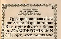
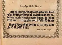
From a surviving 1681 specimen, Stan Knight comments that in his type "the capitals are generally quite wide, and many of them...have a strong thick/thin contrast. The lowercase has comparatively short ascenders, resulting in a large x-height."[23] Max Caflisch felt that a distinguishing feature of van Dijck's types were that "the contrast between the hair lines and the main strokes is more pronounced...the capital letters are more powerful...the typeface in general appears to have been cut more sharply".[4] The polymath Joseph Moxon, who knew him, praised the Dutch types of the period for "commodious fatness they have beyond other letters which easing the eyes in reading, renders them more legible" and van Dijck's in particular for the "harmony and decorum of their symmetry" and the "good reason for his order and method."[24] His types included swash capitals and terminal forms, although smaller numbers than were common in Robert Granjon's italics.[3] Van Dijck worked in a style later described by Pierre Simon Fournier as the goût Hollandois or Dutch taste, which favoured darker type on the page and stronger contrast than earlier types in the Garamond style from the French renaissance.[25] He was likely influenced in this by the earlier Amsterdam punchcutter Nicolaes Briot.[26]

His blackletter types are ornate, with many teardrop terminals, especially on the capitals, apparently again following the lead of types cut by Briot.[19][27]

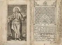
Van Dijck worked extensively on making type in the Armenian alphabet for Armenian printers in Amsterdam. On 27 November 1658 he contracted with the Armenian Matteos Tsaretsi (Matheos van Tsar in Dutch) to make punches and matrices to print an Armenian bible, and continued to work on Armenian types for the rest of his life.[29]
Understanding of van Dijck's career has been limited by a lack of knowledge of what types he cut: as was common for pre-nineteenth century printing materials a large proportion of his punches and matrices were lost due to changing artistic tastes in favour of "modern face" typefaces, being destroyed from around 1808 by Enschedé at a time when it was also in financial difficulties, although some survive at Enschedé,[30] and others in the collection of Oxford University Press.[31] An impressive but jumbled specimen was issued by the widow of Daniel Elzevir in 1681 offering what had been his foundry for sale, of which a single copy survives in the Plantin-Moretus Museum, Antwerp.[32][33][34][8] Fragments of an earlier specimen are also extant at Cambridge University Library.[3]
A specimen issued by van Dijck in 1668/1669 was found to exist in the National Archives in London by historian Justin Howes;[35] according to Lane as of 2013 it had yet to be published.[36]
Besides van Dijck's own types, his foundry sold many older types. For example, by the year after his death Abraham van Dijck owned matrices for a Greek type cut by Robert Granjon.[37][lower-alpha 3] Marshall bought matrices for this type which survive at Oxford University Press, probably from Abraham van Dijck, or possibly another source in the Netherlands; if they did come from van Dijck his foundry was apparently able to source a second set of matrices since the type is advertised on the 1681 specimen.[37] Besides this, on the 1681 specimen a number of other types are also known to be by Granjon, Claude Garamond, Hendrik van den Keere and possibly Pierre Haultin.[31][lower-alpha 4] According to Marshall Amsterdam typefounders were able to buy earlier types from Frankfurt.[39][56]
Van Dijck apparently had a strong reputation in his lifetime and beyond, aided by the connection between Protestant Britain and the Dutch Republic. Marshall considered him a "famous artist".[57] Moxon, who spent time in the Netherlands as a child and later met van Dijck on returning as an adult, wrote soon after his death that "Holland letters in general are in most esteem, and particularly those that have been cut by the hand of that curious artist Christofel van Dijck, and some very few others...when the Stadthouse at Amsterdam was finishing, such was the curiosity of the Lords that were the Overseers of the building, that they offered C. van Dijck aforesaid 80 Pounds Sterling (as himself told me) only for drawing in paper the names of the several offices that were to be painted over the doors, for the painter to paint by"[58] and also praised them extensively in his Mechanick Exercises of 1683.[59] Many, although not all, of his types are also identified in the Enschedé type foundry specimen dated 1768,[lower-alpha 5] specifically his smaller types and blackletters from the middle of the book.
Several digital fonts based on van Dijck's work have been published, including DTL Elzevir (1992) from Dutch Type Library, based on his Augustijn (12pt size) type,[61][62] and Custodia (2002–06) by Fred Smeijers.[63][64]
Legacy

On van Dijck's death, his foundry was taken over by his son Abraham (1645–1672), who was also a punchcutter.[66] Abraham van Dijck sold matrices to Thomas Marshall, who was acting on behalf of Bishop John Fell in Oxford to create a collection of printing materials for Oxford University Press. Many of these survive, as does their correspondence.[67][31][68] Marshall wrote to Fell in April 1670 that "this last winter had sent van Dijck and [Bartholomeus] Voskens, the two best artists in this country, to their graves."[67]
.jpg.webp)
Abraham van Dijck suffered from poor health, and his steadily declining condition forms a large part of Marshall's correspondence.[69] He finally died in February 1672.[70][14][71][lower-alpha 6] The following April the foundry was auctioned,[66] and bought by Daniel Elsevier of the Elzevir family of printers.[34]
In 1680 Daniel Elsevier died. His widow felt unable to run the foundry and placed it up for sale, leading to the printing of the well-known 1681 specimen; she herself died shortly afterwards and before the auction could take place. Following her death it was bought by Joseph Athias, the printer of books in Hebrew who cooperated with the widow of Jan Jacobsz. Schipper printing English bibles.[74][34][75][66] Around 1707 his son Manuel Athias sold his part in the foundry to the heir Cornelia Schipper.[76][77]

In 1755 the family closed the business at Nieuwe Herengracht; the foundry was bought by Jan Roman the younger (1709–1770), bookseller in the Kalverstraat.[78] In 1767 the foundry was auctioned again,[39] and materials bought by both the Enschedé foundry in Haarlem and the Ploos van Amstel brothers in Amsterdam, the latter bought by Enschedé in 1799.[39][79][80] The standing type used to print the 1681 specimen continued to be used by the successors to van Dijck's foundry to print specimens, including the 1768 Enschedé specimen.[81]
Notes
- ↑ Date of birth according to Lane 2012, although in his marriage application in 1642 van Dijck gave his age as 36.[2]
- ↑ This is a slight simplification: technically in metal typesetting a distinction is made between the adjustable hand mould that casts the main body of the type, and the matrix, which is the mould only for the letter shape.
- ↑ This 10pt type, like Granjon's other Greeks, is a copy of Claude Garamond's Grecs du roi types.[38]
- ↑ Specifically, the type of the word "Proeven" is by van den Keere,[39] the Dubbelde Mediaen Kapitalen,[40] Brevier No. 2[41] and Augustijn No. 2[42] romans and Paragon,[43][44] Augustijn,[45] first Mediaen[46] and Garmont italic[47] by Granjon, the Dubblede Descendiaan titling capitals and Text roman by Garamond,[39] and the Mediaen Romeyn No. 2 probably by Pierre Haultin.[48][49] The Brevier italic (the showings share many but not all characters) is of uncertain attribution; it seems to be a copy of a Granjon italic, whether van Dijck or someone else cut it.[50][51][52] The Dubbelde Text [53] and Dubbelde Augustijn[54] capitals may also be by other engravers. According to Lane the unpublished 1668/9 specimen also shows an old-fashioned Greek type in Mediaen size.[55]
- ↑ But probably actually issued in 1769, when a portrait in it is dated.[60]
- ↑ Abraham van Dijck was buried in the Westerkerk on 26 February 1672; van Eeghen's date of 23 February is a mistake.[17] Some writers have also incorrectly believed this death record refers to the little-known painter Abraham van Dijck.[72][73] The fact that the Abraham who was Christoffel van Dijck's son died in February 1672 (new style) is also reported in Marshall's letters to Fell.[70]
References
- ↑ Lane, Lommen & de Zoete 1998, p. 71.
- ↑ Lane 2012, p. 70.
- 1 2 3 McKitterick, David J. (1977). "A Type Specimen of Christoffel van Dijck?". Quaerendo. 7 (1): 66–75. doi:10.1163/157006977X00062.
- 1 2 Middendorp 2004, p. 23.
- ↑ Lommen, Mathieu (1996). "A history of Lettergieterij 'Amsterdam' voorheen N. Tetterode (Typefoundry Amsterdam) 1851-1981". Quaerendo. 26 (2): 120. doi:10.1163/157006996X00089.
- ↑ Rasterhoff, Clara. "The fabric of creativity in the Dutch Republic: Painting and publishing as cultural industries, 1580-1800" (PDF). University of Utrecht (PhD thesis). Retrieved 3 December 2021.
- 1 2 Enschedé 1993, p. 26.
- 1 2 3 4 5 Lane 2004, p. 45.
- 1 2 Lane 2012, p. 73.
- ↑ Lane 2012, pp. 72–73.
- 1 2 Lane 2012.
- 1 2 3 4 Lane 2012, p. 74.
- 1 2 Lane 2004, p. 47.
- 1 2 Hoeflake 1973, p. 114.
- ↑ Eeghen 1960–1978, p. 87.
- ↑ Notarial deeds by Van Dijck: notice of marriage, baptism of his son, purchase of the houses, and burial record; see also Van Eeghen, p. 277-279, 282, 287–288.
- 1 2 3 Eeghen 1960–1978, p. 288.
- ↑ Michel, Émile (17 January 2012). Rembrandt. Parkstone International. p. 193. ISBN 978-1-78310-074-3.
- 1 2 Enschedé 1993, p. 64.
- ↑ Enschedé 1993, pp. 65–66.
- ↑ Enschedé 1993, p. 88.
- ↑ Moxon 1676, p. 4.
- ↑ Knight 2012, p. 53.
- ↑ Moxon 1896, p. 15.
- ↑ Mosley, James. "Type and its Uses, 1455-1830" (PDF). Institute of English Studies. Archived from the original (PDF) on 9 October 2016. Retrieved 7 October 2016.
Although types on the 'Aldine' model were widely used in the 17th and 18th centuries, a new variant that was often slightly more condensed in its proportions, and darker and larger on its body, became sufficiently widespread, at least in Northern Europe, to be worth defining as a distinct style and examining separately. Adopting a term used by Fournier le jeune, the style is sometimes called the 'Dutch taste', and sometimes, especially in Germany, 'baroque'. Some names associated with the style are those of Van den Keere, Granjon, Briot, Van Dijck, Kis (maker of the so-called 'Janson' types), and Caslon.
- ↑ de Jong, Feike. "The Briot project. Part I". PampaType. TYPO, republished by PampaType. Retrieved 10 June 2018.
- ↑ Lane 2013, p. 424.
- ↑ Lane 2012, pp. 77–78.
- ↑ Lane 2012, p. 86.
- ↑ Enschedé 1993, pp. 57, 64.
- 1 2 3 Dreyfus 1963, pp. 17–18.
- ↑ Mosley, James. "Elzevir Letter". Typefoundry (blog). Retrieved 7 November 2017.
- ↑ Shaw 2017, p. 64.
- 1 2 3 Dreyfus 1963, p. 16.
- ↑ "Proeven van alle de LETTEREN die Gesneden zijn van Christoffel van Dyck". National Archives. Retrieved 4 July 2019.
- ↑ "John Lane & Mathieu Lommen: ATypI Amsterdam Presentation". ATypI. Retrieved 12 July 2019 – via YouTube.
- 1 2 Lane 1996, p. 116.
- ↑ Lane 1996, pp. 109–110.
- 1 2 3 4 5 Dreyfus 1963, p. 17.
- ↑ Vervliet 2008, p. 232.
- ↑ Vervliet 2008, p. 223.
- ↑ Vervliet 2008, p. 226.
- ↑ Vervliet 2008, p. 339.
- ↑ Lane 2013, p. 436.
- ↑ Vervliet 2008, p. 348.
- ↑ Vervliet 2008, p. 336.
- ↑ Vervliet 2008, p. 368.
- ↑ Vervliet 2008, pp. 236, 256.
- ↑ Enschedé 1993, p. 58.
- ↑ Dreyfus 1963, p. 18.
- ↑ Lane 2004, p. 48.
- ↑ Vervliet 2008, p. 342.
- ↑ Lane 2013, p. 384.
- ↑ Lane 2013, p. 386.
- ↑ Lane 2013, p. 427.
- ↑ Hart 1900, p. 166.
- ↑ Hart 1900, p. 162.
- ↑ Moxon 1676, pp. 3–5.
- ↑ Moxon 1896, pp. 15–16.
- ↑ Enschedé 1993, p. 22.
- ↑ "DTL Elzevir". Dutch Type Library. Retrieved 6 September 2020.
- ↑ Lane, Lommen & de Zoete 1998, p. 292.
- ↑ Shaw 2017, pp. 64–65.
- ↑ "Custodia". Type By. Retrieved 25 June 2021.
- ↑ Willems, Alphonse (1880). Les Elzevier: histoire et annales typographiques. pp. lxxix–lxxxvii. Retrieved 19 June 2021.
- 1 2 3 Hoeflake 1973, p. 115.
- 1 2 Hart 1900, p. 161.
- ↑ Ould 2013, pp. 215–6.
- ↑ Hart 1900, pp. 162–3.
- 1 2 Hart 1900, p. 171.
- ↑ Lane 2004, p. 46.
- ↑ Jonathan Bikker; Willem Drost (1 January 2005). Willem Drost (1633–1659): A Rembrandt Pupil in Amsterdam and Venice. Yale University Press. p. 34. ISBN 0-300-10581-9.
- ↑ Amy Golahny; Mia M. Mochizuki; Lisa Vergara (2006). In His Milieu: Essays on Netherlandish Art in Memory of John Michael Montias. Amsterdam University Press. p. 268. ISBN 978-90-5356-933-7.
- ↑ M.M. Kleerkooper, De boekhandel te Amsterdam voornamelijk in de 17e eeuw, deel 1
- ↑ Lane 2012, p. 105.
- ↑ Lane, Lommen & de Zoete 1998, p. 300.
- ↑ Familiearchief Cambier. In: Nationaal Archief
- ↑ Eeghen 1960–1978, p. 301.
- ↑ Hoeflake 1973, p. 116.
- ↑ Lane, Lommen & de Zoete 1998, p. 62.
- ↑ Enschedé 1993, p. 48.
Cited literature
- Dreyfus, John, ed. (1963). Type Specimen Facsimiles. London: Bowes & Bowes, Putnam. pp. 16–18.
- Eeghen, Isabella Henriette van (1960–1978). De Amsterdamse boekhandel 1680–1725. Amsterdam. ISBN 9789060721315. Retrieved 14 June 2021.
{{cite book}}: CS1 maint: location missing publisher (link) - Enschedé, Johannes (1993). Lane, John A. (ed.). The Enschedé type specimens of 1768 and 1773: a facsimile ([Nachdr. d. Ausg.] 1768. ed.). Stichting Museum Enschedé, the Enschedé Font Foundry, Uitgeverij De Buitenkant. pp. 29–30 etc. ISBN 9070386585.
- Enschedé, Charles (1978). Carter, Harry; Hellinga, Lotte (eds.). Typefoundries in the Netherlands, from the fifteenth to the nineteenth century: a history based mainly on material in the collection of Joh. Enschedé en Zonen at Haarlem (2nd ed.). Haarlem: Stichting Museum Enschedé. pp. 77–94. ISBN 9789070024130.
- Hart, Horace (1900). Notes on a Century of Typography at the University Press, Oxford, 1693–1794. Oxford: Oxford University Press. Retrieved 6 September 2020.
- Hoeflake, Netty (7 June 1973). "Van Dijck". A Tally of Types. CUP Archive. pp. 113–6. ISBN 978-0-521-09786-4.
- Knight, Stan (2012). Historical Types: from Gutenberg to Ashendene. New Castle, Delaware: Oak Knoll Press. ISBN 9781584562986.
- Lane, John A. (1996). "From the Grecs du Roi to the Homer Greek: Two Centuries of Greek Printing Types in the Wake of Garamond". In Macrakis, Michael S. (ed.). Greek Letters: From Tablets to Pixels. Oak Knoll Press. ISBN 9781884718274.
- Lane, John A.; Lommen, Mathieu; de Zoete, Johan (1998). Dutch Typefounders' Specimens from the Library of the KVB and other collections in the Amsterdam University Library with histories of the firms represented. De Graaf. Retrieved 4 August 2017.
- Lane, John A. (2004). Early Type Specimens in the Plantin-Moretus Museum. Oak Knoll Press. pp. 45–9. ISBN 9781584561392.
- Lane, John A. (2012). The Diaspora of Armenian Printing, 1512-2012. Amsterdam: Special Collections of the University of Amsterdam. pp. 70–86, 211–213. ISBN 9789081926409.
- Lane, John A. (27 June 2013). "The Printing Office of Gerrit Harmansz van Riemsdijck, Israël Abrahamsz de Paull, Abraham Olofsz, Andries Pietersz, Jan Claesz Groenewoudt & Elizabeth Abrahams Wiaer c.1660–1709". Quaerendo. 43 (4): 311–439. doi:10.1163/15700690-12341283.
- Middendorp, Jan (2004). Dutch Type. 010 Publishers. pp. 23–25. ISBN 978-90-6450-460-0.
- Moxon, Joseph (1676). Regulæ trium ordinum literarum typographicarum, or, The rules of the three orders of print letters : viz. The Roman Italick English capitals and small : shewing how they are compounded of geometrick figures, and mostly made by rule and compass : useful for writing masters, painters, carvers, masons, and others that are lovers of curiosity. London: Joseph Moxon. Retrieved 19 June 2021.
- Moxon, Joseph (1896). de Vinne, Theodore (ed.). Moxon's Mechanick exercises; or, The doctrine of handy-works applied to the art of printing; a literal reprint in two volumes of the first edition published in the year 1683, Volume 1. New York: The Typothetæ of the City of New York. Retrieved 19 June 2021.
- Ould, Martyn (November 2013). Gadd, Ian (ed.). History of Oxford University Press: Volume I: Beginnings to 1780. Oxford University Press. pp. 212–221. ISBN 978-0-19-955731-8.
- Shaw, Paul (18 April 2017). Revival Type: Digital Typefaces Inspired by the Past. Yale University Press. pp. 48, 61. ISBN 978-0-300-21929-6.
- Vervliet, Hendrik D. L. (2008). The Palaeotypography of the French Renaissance: Selected Papers on Sixteenth-century Typefaces. BRILL. ISBN 978-90-04-16982-1.