 | |
| Category | Sans-serif |
|---|---|
| Classification | Humanist[1] |
| Designer(s) | Frederic Goudy |
| Foundry | Lanston Monotype ITC |
| Date created | 1929 |
| Variations | ITC Goudy Sans |
| Also known as | Goudy Sans Serif |
Goudy Sans is a sans-serif typeface designed by Frederic Goudy around 1929–1931 and published by Lanston Monotype.[2][3][4][5]
Unlike many sans-serifs, which often have an unadorned appearance with a geometric or industrial aesthetic, Goudy Sans has a more organic and decorative structure resembling painted lettering, with flared stroke ends and an avoidance of straight lines, typifying Goudy's taste towards designs with an organic feel.[6][7][8][9] Goudy added several complementary decorative alternate characters.[10] Goudy drew a complementary italic with letterforms inspired by handwriting, decorative features such as swashes and curls, again with a number of decorative alternates.[11][12] Lewis Blackwell in 20th-Century Type describes it as "something of a sport...with pronounced tendency to the inscriptional in its 'chiselled' junctions".[13] The proportions of the lower-case are slightly condensed.[9][14]
Goudy described the design as not popular in his lifetime and did not give it a specific name; it was published as "Goudy Sans Serif" in his lifetime.[10][8][2][15] However, it has been re-released and digitised several times, mostly under the shortened name of Goudy Sans.
Digitisations
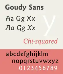
Goudy Sans has been digitised by P22 under its LTC imprint in a version relatively similar to the original metal type.[16] During the phototypesetting period of printing, Compugraphic developed a new version with adjusted proportions and an expanded range of weights.[17] This was re-released and expanded by ITC to form a popular four-weight version, shown in the sample for this article.[18][19][20] The ITC release was also re-released by Adobe.[21][22]
References
- ↑ Richard Poulin (31 October 2017). Design School: Type: A Practical Guide for Students and Designers. Rockport Publishers. pp. 65–7. ISBN 978-1-63159-320-8.
- 1 2 "Goudy+Sans" "New Goudy Sans Serif Announced by Lanston". Printing. 1931.
A decade ago Frederic W. Goudy, sensing the need for a more pleasing treatment of the uninteresting block letter commonly known as "Printers' Gothic," published in 1922 his book entitled "Elements of Lettering," in which he showed reproductions of original drawings of a face called "Goudy Gothic". At that time the face had not progressed beyond original drawings of capitals and figures. The design demonstrated how a letter more pleasing than the average block type could be produced with very slight modifications in form and in detail. Some four years later, the first of the redesigned, revamped and rechristened block types called "sans serif" made its appearance via foreign sources. Other sans serifs, including the Monotype Sans Serif Family, followed in rapid succession and found ready acceptance in the industry. Mr Goudy's original "Goudy Gothic" has been renamed and with an added lower case and interesting "alternative" characters is now available on the Monotype in 14, 18, 24, 30 and 36 point sizes under the name Goudy Sans Serif Light and Goudy Sans Serif Bold.
- ↑ "Lanston Monotype Machine Company announces the completion of its new Goudy Sans". Inland Printer. 87: 92. 1931.
- ↑ Printed Salesmanship. 57: 440–456. 1932.
{{cite journal}}: Missing or empty|title=(help) - ↑ Practical Handbook on Display Typefaces for Publication Layout. 1959.
Monotype No. 384…Goudy's san-serif series is among his lesser- known designs; it is, we believe, to his credit that, unlike most of his fellow craftsmen, he came up with a letter which did not seem identical to all the others.
- ↑ Shaw, Paul. "An appreciation of Frederic W. Goudy as a type designer". Retrieved 12 July 2015.
- ↑ Sloane, Eric (April 2006). Return to Taos: Eric Sloane's Sketchbook of Roadside Americana. Courier Corporation. pp. 8–9. ISBN 978-0-486-44773-5.
- 1 2 Clair, Kate; Busic-Snyder, Cynthia (20 June 2012). A Typographic Workbook: A Primer to History, Techniques, and Artistry. John Wiley & Sons. p. 304. ISBN 978-1-118-39988-0.
- 1 2 Tam, Keith (2002). Calligraphic tendencies in the development of sanserif types in the twentieth century (PDF). Reading: University of Reading (MA thesis). pp. 31–2. Archived from the original (PDF) on 2015-09-06. Retrieved 2016-06-12.
- 1 2 Goudy, Frederic (1946). A Half-Century of Type Design and Typography, Volume 2. New York: The Typophiles. pp. 164–187. Retrieved 11 June 2016.
- ↑ Majoor, Martin. "My type design philosophy". Martin Majoor Type Design. Retrieved 12 June 2016.
- ↑ Majoor, Martin (Spring 2007). "Inclined to be dull". Eye. Retrieved 3 August 2015.
- ↑ Blackwell, Lewis (2004). 20th-Century Type. Laurence King Publishing. pp. 201–. ISBN 978-1-85669-351-6.
- ↑ Phinney, Thomas. "Twitter post". Twitter. Retrieved 12 June 2016.
ITC Goudy Sans [is] too light & narrow for 9–10 pt text
- ↑ Bruckner, D.J.R. (1990). Frederic Goudy. New York: Documents of American Design. pp. 134–5. ISBN 9780810910355.
This unhappy face was made for Lanston Monotype to compete with the new sans serifs coming into the United States from Germany and England. It disappointed Goudy as much as it did Lanston Monotype.
- ↑ "LTC Goudy Sans". MyFonts. LTC. Retrieved 27 August 2015.
- ↑ "ITC Goudy Sans". MyFonts. ITC. Retrieved 27 August 2015.
- ↑ "ITC Goudy Sans". Upper & Lower Case. International Typeface Corporation. 13 (1): 32–36. 1986. Retrieved 12 June 2016.
- ↑ Coles, Stephen (6 April 2012). "Electrical Banana". Fonts in Use. Retrieved 12 June 2016.
- ↑ "ITC Goudy Sans, USA, 1986". Collezione Tipografia del Novecento. Associazione Italiana Design della Communicazione Visiva. Retrieved 3 May 2018.
- ↑ "Goudy Sans FS". Fontsite. Retrieved 27 August 2015.
- ↑ "Adobe ITC Goudy Sans". MyFonts. Adobe. Retrieved 27 August 2015.