 | |
| Category | Sans-serif |
|---|---|
| Classification | Geometric |
| Designer(s) |
|
| Foundry | International Typeface Corporation |
| Date released | 1970–1977 |
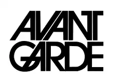
ITC Avant Garde Gothic is a geometric sans serif font family based on the logo font used in the Avant Garde magazine. Herb Lubalin devised the logo concept and its companion headline typeface, and then he and Tom Carnase, a partner in Lubalin's design firm, worked together to transform the idea into a full-fledged typeface.
The condensed fonts were drawn by Ed Benguiat in 1974, and the obliques were designed by André Gürtler, Erich Gschwind and Christian Mengelt in 1977.
The original designs include one version for setting headlines and one for text copy. However, in the initial digitization, only the text design was chosen, and the ligatures and alternate characters were not included.
The font family consists of five weights (four for condensed), with complementary obliques for widest width fonts.
When ITC released the OpenType version of the font, the original 33 alternate characters and ligatures, plus extra characters were included.
Elsner+Flake also issued the ligatures and alternate characters separately as Avant Garde Gothic Alternate.
Cold Type versions
ITC Avant Garde was never cast into actual foundry type, appearing first only in cold type. Alphatype, Autologic, Berthold, Compugraphic, Dymo, Star/Photon, Harris, Mergenthaler, MGD Graphic Systems, and Varityper all sold the face under the name Avant Garde, while Graphic Systems Inc. offered the face as Suave.[1]
Digital versions
ITC Avant Garde Gothic Pro
It is an OpenType variant of the original ITC Avant Garde Gothic, plus a suite of additional cap and lowercase alternates, new ligatures, unicase glyphs. It supports ISO Adobe 2, Adobe CE, Latin Extended character sets.
In addition, the obliques are altered from the original, where optical corrections are no longer used.[2]
ITC Avant Garde Mono
It is a monospaced version designed by Ned Bunnel in 1983.
Digital version was produced by Elsner+Flake. The family consists of 4 fonts in 2 weights (bold and light) in 1 width, with complementary italics.
William Sans LET
William Sans LET is a very similar font, but the "regular" typeface is known as "Plain 1.0".
Derivatives
ITC Lubalin Graph is a slab-serif version of ITC Avant Garde, also designed by Lubalin.[3]
Uses
 Used as the logo of the Government of Alberta until 2009, and appeared on standard Vehicle registration plates of Alberta until 2019.
 The logo of Japanese idol group AKB48
 Century 21 logo from 1991 to 2018
 The Macy's logo used Avant Garde typeface in its extra light style until 2019.
 The Netflix TV series Master of None used the font for its title cards. The title itself uses ITC Avant Garde Gothic with alternatives.[7]
 The 1971 PBS logo uses this font for its full broadcaster name text.
 From 1976 until 2023, Rede Globo used a custom version of the ITC Avant Garde font for its wordmark and for another of its logos.[8]
 Vehicle registration plates of Texas used Avant Garde typeface for the state name on Passenger base plates from 1986 to 1990, and until 2002 on handicap and personalized plates.
.jpg.webp) Vehicle registration plates of South Korea used modified version of Avant Garde typeface for all kind of vehicles.
Vehicle registration plates of South Korea used modified version of Avant Garde typeface for all kind of vehicles. The Avant Garde typeface used the Travis logo by the band since the album "The Man Who" in 1999.
 The ‘1921’ & ‘2021’ was used Avant Garde typeface in logo of the 100th anniversary of the founding of the CPC.
Miscellaneous
- Main font used for the Eurovision Song Contest 2011, including the slogan and voting scoreboard.[10]
- Used as the logo for GM Goodwrench until the brand was renamed GM Certified Service in 2011.
- Used for the logo of the ACS journal Chemical Reviews.
- Rock Band video games, one through three, use the font for its menus. In the first game, the alternative characters are mainly used.[11][12]
- Used prominently in the title and gameplay of the video game Control.
- Used in title sequence of Stranger Things for the actors' and actresses' names fading in and out.
- Used in the opening and closing credits of the Back To The Future trilogy.
- Used in the opening and closing credits of Beethoven and Beethoven’s 2nd.
- Used in the opening and closing credits of National Lampoon’s Vacation and European Vacation.
Also used for the original subtitles featured throughout the latter film.
- Used in general signage for the defunct Walt Disney World Resort attraction, ExtraTERRORestrial Alien Encounter.
- Used in Twice’s logo since 2015.
- Used in the closing credits of Disney+ series, The Santa Clauses.
Similar

- URW Gothic L is a similar font with identical metrics, intended for use as a replacement for ITC Avant Garde in the PostScript Base 35 fonts for the Ghostscript program. The font has since been released under free and open source terms.
- TeX Gyre Adventor is an open-source extension of the above font adding many new characters, and special alternate glyphs.
- Birth of a Hero is a third-party distressed version of Avant Garde created by Segments Design, featuring many of the oblique characters.
See also
References
- ↑ Lawson, Alexander, Archie Provan, and Frank Romano, Primer Metal Typeface Identification, National Composition Association, Arlington, Virginia, 1976, pp. 34 - 35.
- ↑ Ain't What ITC Used to Be
- ↑ ITC Lubalin Graph Font Family - by Herb Lubalin, Ed Benguiat
- ↑ "Fonts Logo » Defected Logo Font". fontslogo.com. Retrieved 2019-03-05.
- ↑ "Font ?! - forum | dafont.com". www.dafont.com. Retrieved 2019-03-05.
- ↑ "YOU ARE DEFECTED - forum | dafont.com". www.dafont.com. Retrieved 2019-03-05.
- ↑ "Master of None Logo?? - forum | dafont.com". www.dafont.com. Retrieved 2018-07-21.
- ↑ "Por que não se deve usar a fonte AvantGarde • IFDBlog". IFD Comunicação (in Brazilian Portuguese). 2006-04-25. Retrieved 2020-02-17.
- ↑ "RE/MAX BRAND REFRESH". RE/MAX. August 2017. Retrieved 2020-07-09.
- ↑ "The Branding Source". brandingsource.blogspot.com. Retrieved 2020-01-13.
- ↑ "Rock Band Fonts — Harmonix Forums". forums.harmonixmusic.com. Retrieved 2018-12-30.
- ↑ "Rock Band Credits Part 1". YouTube. Archived from the original on 2021-12-21. Retrieved 2018-12-30.
External links
- ITC Classics: ITC Avant Garde Gothic Pro
- What's Hot From ITC: October 2005
- Type Trading Card #11
- ITC Avant Garde Gothic Font Family - by Herb Lubalin, Tom Carnase (renewed reference)
- Paratype: ITC Avant Garde Gothic font
- FontShop: Avant Garde Gothic Alternate
- ITC Avant Garde Mono - now a suspended page
- Adobe - ITC Avant Garde Gothic Std Full Family