 | |
| Category | Serif |
|---|---|
| Classification | Transitional |
| Foundry | Monotype |
| Variations | Imprint MT Shadowed |
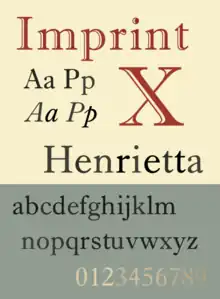
Imprint is a serif typeface created by Monotype, commonly used for body text. Originally called Imprint Old Face, it is a sturdy, amiable design with a large x-height, Caslon-like but with more regularity in its letterforms.[1] It was commissioned by the London publishers of The Imprint, a short-lived printing trade periodical published during 1913.[2]
Imprint has remained popular and is sold digitally by Monotype.[3][4] A "shadowed" or inline version, with a cut taken out of the letters, has been widely released with Microsoft software, and is often used, especially in desktop publishing, for mastheads and titles.[5]
History
Imprint was produced for the magazine (on a non-exclusive basis) in 1912 by the Monotype Company as Series 101 for automatic composition on the Monotype caster.[6] When delivered to the journal's printers on December 31, 1912, it was still incomplete—the accents had not yet been made—so the editors asked in the first issue: “Will readers kindly insert them for themselves, if they find their omission harsh? For ourselves, we rather like the fine careless flavour, which their omission gives, after we have recovered from the first shock inevitable to us typographical precisians”.[7] Its design was carried out by the Monotype engineering team in Salfords, Surrey, led by engineer Frank Hinman Pierpont and draughtsman Fritz Stelzer.[lower-alpha 1]
James Mosley describes Imprint as "an intelligent updating of Caslon" and has credited the Monotype team for crafting a "re-draw [done] in a manner that suited modern machine printing while keeping as much as possible of the spirit of the original."[8][9] Contemporary type designer Kris Sowersby has praised it for its "subtle, gentle stress and its restrained detailing".[10]
Perhaps the most notable use since then has been for the entire setting of the Second Edition of the Oxford English Dictionary (1989), 22,000 pages of precisely structured typography in 20 volumes.
Digital versions
It is available today as a digital OpenType font from Monotype's successor, Monotype Imaging, in regular, italic, bold and bold italic styles, as well as shadowed and shadowed italic styles (matching the bold weight).[11] The current Pro release features text figures and small caps, the latter in the roman or regular style only.[4]
Sowersby's Untitled Serif is also loosely inspired by Imprint.[10]
References
- ↑ Slinn, Judy; Carter, Sebastian; Southall, Richard. History of the Monotype Corporation. pp. 198-203 etc.
- ↑ McKitterick, David (2004). A history of Cambridge University Press (1. publ. ed.). Cambridge: Cambridge University Press. ISBN 9780521308038.
- ↑ Williamson, Hugh (1956). Methods of Book Design. p. 98.
- 1 2 "Imprint MT". MyFonts. Monotype. Retrieved 12 July 2015.
- ↑ "Imprint MT". Microsoft Typography. Microsoft. Retrieved 12 July 2015.
- ↑ The Monotype Chronicles 1907 – 1916
- ↑ The Imprint, January 1913, p. vi
- ↑ Mosley, James (2001). "Review: A Tally of Types". Journal of the Printing Historical Society. 3, new series: 63–67.
- ↑ Mosley, James. "Eric Gill's Perpetua Type". Fine Print.
- 1 2 Sowersby, Kris. "Untitled Sans & Serif". Klimtype. Retrieved 13 August 2017.
- ↑ "Fonts.com: Imprint Volume". Archived from the original on 2011-09-29. Retrieved 2011-02-09.
- ↑ Some sources have credited Imprint's actual design to the Imprint's editorial team led by Mason, Meynell and Edward Johnston, although Walter Tracy and Morison describe this as more a requested concept than actual participation in the font's design.