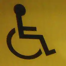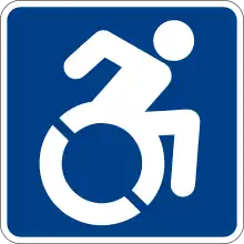
The International Symbol of Access (ISA), also known as the (International) Wheelchair Symbol, denotes areas where access has been improved, mostly for those with disabilities. It consists of a usually[1] blue square overlaid in white (or in contrasting colours) with a stylized image of a person in a wheelchair. It is maintained as an international standard, ISO 7001 image of the International Commission on Technology and Accessibility (ICTA), a committee of Rehabilitation International (RI).[2]
History
The ISA was designed by Danish design student Susanne Koefoed in 1968. It was first sketched at a radical design conference mounted by the Scandinavian Students Organization (SDO).[3] The group organized a summer study session at Stockholm's art and design college, Konstfack, alternating time between workshop sessions and larger lectures. In these lectures, the tone was set by the American designer and educator Victor Papanek. In the writings that he formulated during this period, too, he imagined persons who were disabled—both physically and mentally—as figures in need of renewed attention.[4] Although there is no evidence that Papanek met Koefoed, his influence pervaded the seminar where the original ISA was drafted. Charged with creating a sign-symbol to mark barrier-free accommodations, Koefoed presented an early version of the symbol at the July 1968 exhibition held at the SDO seminar's end. Koefoed's symbol depicts an empty wheelchair. This icon was widely promoted around Sweden the following year.[5]
Karl Montan, director of Sweden's new Handicapped Institute, also promoted Koefoed's design to Rehabilitation International. Montan worked to develop a symbol specifically as a technical aid[6] Head of RI's International Commission of Technology and Accessibility (ICTA), Montan was asked by RI to form a special committee that would find and deliver a symbol to the group's 1969 convention in Dublin.[7] Montan's group was asked to choose from six symbols. When Koefoed's symbol was presented, several members complained that it was too austere and illegible. As Montan noted: "a slight inconvenience with the symbol is the equally thick lines, which may give an impression of a monogram of letters. With a 'head' on the symbol this inconvenience would disappear."[8] Taking the original copy of the design, Montan would add a circle to the top of the seat to give the impression of a seated figure.
Functions

The symbol is often seen where access has been improved, particularly for wheelchair users, but also for other disability issues.[9] Frequently, the symbol denotes the removal of environmental barriers, such as steps, which also helps older people, parents with baby carriages, and travellers.[10] Universal design aims to obviate such symbols by creating products and facilities that are accessible to nearly all users from the start. The wheelchair symbol is "International" and therefore not accompanied by Braille in any particular language.
Specific uses of the ISA include:
- Marking a parking space reserved for vehicles used by people with disabilities/blue badge holders
- Marking a vehicle used by a person with a disability, often for permission to use a space
- Marking a public lavatory with facilities designed for wheelchair users
- Indicating a button to activate an automatic door
- Indicating an accessible transit station or vehicle
- Indicating a transit route that uses accessible vehicles
The ISA is assigned the Unicode code point U+267F ♿ WHEELCHAIR SYMBOL,[11] displaying similarly to ![]() if a compatible font is available on the computer system.
if a compatible font is available on the computer system.
Building codes such as the California Building Code, require "a white figure on a blue background. The blue shall be equal to Color No. 15090 in Federal Standard 595B."[12]
Modified ISA

Some disability activists are advocating for a modified access symbol. Sara Hendren and Brian Glenney co-founded the Accessible Icon project, designing the new icon to display an active, engaged image with focus on the person with disability.[13] Some disability organizations such as Enabling Unit in India are promoting it,[14] This version of the symbol is officially used in the U.S. states of New York and Connecticut.[15][16] The Modified ISA is in the permanent collection of Museum of Modern Art.[17]
The Accessible Icon has also had detractors within the disabled community. According to Emma Teitel of the Toronto Star, critics say that the modified image does not universally represent all disabled people, since it socially stigmatizes those who have a disability but do not use a wheelchair.[18] Critics have defended the old International Symbol of Access for its more abstract design, which leaves more to the imagination and can represent any disability.[19][20]
In May 2015, the Federal Highway Administration rejected the new design for use on road signs in the United States, citing the fact that it has not been adopted or endorsed by the U.S. Access Board, the agency responsible for developing the federal criteria for accessible design. The International Organization for Standardization, which established the regular use of the original symbol under ISO 7001, has also rejected the design.[21]
References
- ↑ "Handicap Parking Permit: Application, Types and Proper Use". WeCapable. 2021-09-03. Retrieved 2022-02-17.
- ↑ "International Symbol of Accessibility". Rehabilitation International. Retrieved 2016-09-07.
- ↑ Guffey, Elizabeth (2015). "The Scandinavian Roots of the International Symbol of Access". Design and Culture. 7 (3): 357–376. doi:10.1080/17547075.2015.1105527. S2CID 147008626.
- ↑ Papanek, Victor, Design for the Real World. New York: Pantheon Books, 1971
- ↑ Guffey, Elizabeth (2015). "The Scandinavian Roots of the International Symbol of Access". Design and Culture. 7 (3): 371. doi:10.1080/17547075.2015.1105527. S2CID 147008626.
- ↑ Guffey, Elizabeth (2017). Designing Disability: Symbols, Spaces and Society. Bloomsbury. pp. [E-reader version, Retrieved from https://books.google.com/books?id=Yp0-DwAAQBAJ&printsec=frontcover#v=onepage ]. ISBN 978-1-350-00426-9.
- ↑ Rehabilitation International – Symbol of Access Archived 2011-06-14 at the Wayback Machine
- ↑ International Committee on Technical Aids (1969) Symbol of accessibility (Stockholm, ISRD- ICTA)
- ↑ Ben‐Moshe, Liat; Powell, Justin J.W. (2007). "Sign of our Times: Revis(it)ing the International Symbol of Access". Disability & Society. 22 (5): 489–505. doi:10.1080/09687590701427602. S2CID 34075172.
- ↑ "Powell, J. J. W. and L. Ben-Moshe (2009). The Icons of Access: From Exclusion to Inclusion. Stimulus Respond "icon" issue, Autumn 2009: 90–95" (PDF). Archived from the original (PDF) on 2011-07-16. Retrieved 2009-11-22.
- ↑ "The Unicode Standard, Version 5.0" (PDF). The Unicode Consortium. 2006. p. 211. Retrieved 2007-07-26.
- ↑ "California Building Code 2010, Section 1117B.5.8". Archived from the original on 2016-06-24. Retrieved 2013-10-13.
- ↑ "Wheelchair icon revamped by guerrilla art project". The Boston Globe.
- ↑ "Medical Partners I The Accessible Icon Project". Archived from the original on 2013-07-01.
- ↑ Chokshi, Niraj (29 July 2014). "The handicap symbol gets an update—at least in New York state". The Washington Post. Retrieved 13 May 2015.
- ↑ "Gov. Malloy Announces Modernized Symbol and Language to be Phased in on New Reserved Parking Signs" (Press release). June 2016. Archived from the original on 2016-10-05. Retrieved 2016-10-04.
- ↑ "Museum of Modern Art".
- ↑ Teitel, Emma (26 April 2017). "Critics of new 'dynamic' disability symbol not just anti-PC cranks: Teitel". Toronto Star. Toronto Star Newspapers Ltd. Retrieved 25 November 2018.
- ↑ Frost, Natasha (March 29, 2018). "The Controversial Process of Redesigning the Wheelchair Symbol". Atlas Obscura.
- ↑ Guffey, Elizabeth (2017). Designing Disability: Symbols, Space, and Society. London: Bloomsbury Academic. ISBN 9781350004252.
- ↑ "Interpretation Letter 2(09)-111(I)".
External links
- Mars, Roman (18 February 2014). "Episode 102: Icon For Access". 99% Invisible. Retrieved 12 October 2015. An episode of the 99% Invisible podcast on the Accessible Icon Project.