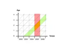
In demography a Lexis diagram (named after economist and social scientist Wilhelm Lexis) is a two dimensional diagram used to represent events (such as births or deaths) that occur to individuals belonging to different cohorts. Calendar time is usually represented on the horizontal axis, while age is represented on the vertical axis. In some cases, the y-axis is plotted backwards, with age 0 at the top of the page and increasing downwards. Other arrangements of the axes are also seen, and some go back to Lexis himself.[1] As an example the death of an individual in 2009 at age 80 is represented by the point (2009,80); the cohort of all persons born in 1929 is represented by a diagonal line starting at (1929,0) and continuing through (1930,1), (1931, 2), and so on.
References
Further reading
- Feeney, Griffith. Lexis Diagram. In: Paul Demeny and Geoffrey McNicoll (eds.) Encyclopedia of Population, Volume 2, Macmillan Reference USA, 2003, 586-588.
- N. Keyfitz: Introduction to the mathematics of population, Addison-Wesley, 1968, page 10
- United Nations Statistics Division 2004 Lexis Diagrams. Annex to Handbook on the Collection of Fertility and Mortality Data, 90-101. Statistics and Statistical Methods Publications, Series F, No. 92. Available in Arabic, Chinese, English, French, Russian and Spanish. New York: United Nations, 2004.
External links
- Démographie sur le web (ed.). "Introduction to Lexis diagram (in French)". Archived from the original on 2013-01-15.
- Vandeschrick, Christophe (2001). "The Lexis diagram, a misnomer" (PDF). Demographic Research. 4: 97–124. doi:10.4054/DemRes.2001.4.3.