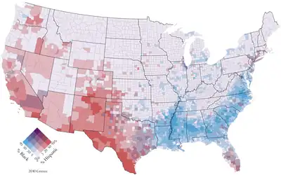
A bivariate map or multivariate map is a type of thematic map that displays two or more variables on a single map by combining different sets of symbols.[1] Each of the variables is represented using a standard thematic map technique, such as choropleth, cartogram, or proportional symbols. They may be the same type or different types, and they may be on separate layers of the map, or they may be combined into a single multivariate symbol.
The typical objective of a multivariate map is to visualize any statistical or geographic relationship between the variables. It has potential to reveal relationships between variables more effectively than a side-by-side comparison of the corresponding univariate maps, but also has the danger of Cognitive overload when the symbols and patterns are too complex to easily understand.[2]: 331
History
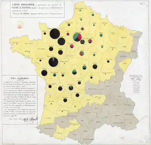
The first multivariate maps appeared in the early Industrial era (1830-1860), at the same time that thematic maps in general were starting to appear. An 1838 booklet of maps produced by Henry Drury Harness for a report on Irish railroads included one that simultaneously showed city populations as proportional symbols and railroad traffic volume as a Flow map.[3][4]
Charles Joseph Minard became a master at creating visualizations that combined multiple variables during the 1850s and 1860s, often mixing choropleth, flow lines, proportional symbols, and statistical charts to tell complex stories visually.[5]
Multivariate thematic maps found a resurgence starting in the middle of the 20th Century, coinciding with the scientific turn in geography. George F. Jenks introduced the bivariate dot density map in 1953.[6] The first modern bivariate choropleth maps were published by the U.S. Census Bureau in the 1970s.[7] Their often complex patterns of multiple colors has drawn acclaim and criticism ever since,[8] but has also led to research to discover effective design techniques.[9][10]
Starting in the 1980s, computer software, including the Geographic information system (GIS) facilitated the design and production of multivariate maps.[11] In fact, a tool for automatically generating bivariate choropleth maps was introduced in Esri's ArcGIS Pro in 2020.
Methods
There are a variety of ways in which separate variables can be mapped simultaneously, which generally fall into a few approaches:
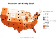
- A multi-layered thematic map portrays the variables as separate map layers, using different thematic map techniques. An example would be showing one variable as a choropleth map, with another variable shown as proportional symbols on top of the choropleth.
- A correlated symbol map represents two or more variables in the same thematic map layer, using the same visual variable, designed in such a way as to show the relative combination of the two variables.
- A bivariate choropleth map is the most common type of correlated symbol. Contrasting but not complementary colors are generally used, so that their combination is intuitively recognized as "between" the two original colors, such as red+blue=purple.[10] They have been found to be more easily used if the map includes a carefully designed legend and an explanation of the technique.[12] A common legend strategy is a two dimensional matrix, divided into smaller boxes where each box represents a unique relationship of the variables.
- A multivariate dot density map mixes dots of different colors in each district, typically representing separate subgroups of the overall population.[6]
- A multivariate symbol map represents two or more variables in the same thematic map layer, using distinct visual variables for each variable.[2]: 337 [13] For example, a layer of cities might be symbolized with circles of proportional size representing its total population, and the hue of each circle representing the predominant source type of its electric power, akin to a nominal choropleth map.
- A cartogram distorts the size and shape of a set of districts according to a variable, but does not dictate the symbol used to draw each district. Thus it is common to symbolize them as a choropleth map.
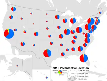
- A chart map represents each geographic feature with a statistical chart, often a pie chart or bar chart, which can include a number of variables. Each chart is usually drawn proportionally to a total, making it a multivariate symbol.
- Chernoff faces have occasionally been used in maps since the 1970s, generally in an experimental situation.[14][15] This technique constructs a complex point symbol that looks like a face, with various facial features distorted to represent various variables, in an attempt to leverage the innate human experience of interpreting meaning from facial expressions. Experimental results have generally been mixed, and the technique has never gained wide popularity.[13]
- A small multiple is a series of small maps, arranged in a grid or array, each of which shows a different (but possibly related) variable over the same space.[16] It has been argued that this is not technically a multivariate map because it is a set of separate maps,[1] but it is included here because it is intended to accomplish the same purpose.
Advantages and criticisms
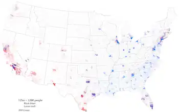
Multivariate thematic maps can be a very effective tool for discovering intricate geographic patterns in complex data.[1] If executed well, related patterns between variables can be recognized easier in a multivariate map than by comparing separate thematic maps.
The technique works best when the variables happen to have a clear geographic pattern, such as a high degree of spatial autocorrelation, so that there are large regions of similar appearance with gradual changes between them, or a generally strong correlation between the two variables. If there is no clear pattern, the map can become an overwhelming mix of random symbols.
A second problem occurs when the symbols do not harmonize well. In keeping with Gestalt psychology, a multivariate map will work best when map readers can isolate patterns in each variable independently, as well as comparing them to each other. This occurs when the map symbols follow the gestalt principles of grouping. Conversely, it is possible to select thematic symbol strategies that are effective on their own, but do not work together well, such as a proportional point symbol that obscures the choropleth map underneath, or a bivariate choropleth map using base colors that create unintuitive mixed colors.
A third issue arises when a map, or even a single symbol, is overloaded with too many variables that cannot be efficiently interpreted.[17] Chernoff faces have often been criticized for this effect.
Thus, many multivariate maps turn out to be technically impressive, but practically unusable.[13] This means that the cartographer must be able to critically evaluate whether a multivariate map she has designed is actually effective. It has also been suggested that in some cases, a map might not be the best tool for studying a particular multivariate dataset, and other analytical methods may be more enlightening, such as cluster analysis.[2]: 344
See also
References
- 1 2 3 Nelson, J. (2020). Multivariate Mapping. The Geographic Information Science & Technology Body of Knowledge (1st Quarter 2020 Edition), John P. Wilson (ed.). DOI: 10.22224/gistbok/2020.1.5
- 1 2 3 T. Slocum, R. McMaster, F. Kessler, H. Howard (2009). Thematic Cartography and Geovisualization, Third Edn. Pearson Prentice Hall: Upper Saddle River, NJ.
- ↑ Robinson, Arthur H. (Dec 1955). "The 1837 Maps of Henry Drury Harness". The Geographical Journal. 121 (4): 440–450.
- ↑ Griffith, Richard John; Harness, Henry Drury (1838). Atlas to Accompany 2nd Report of the Railway Commissioners. Ireland.
- ↑ Tufte, Edward (2006). Beautiful Evidence. Graphics Press.
- 1 2 Jenks, George F. (1953). ""Pointillism" as a Cartographic Technique". The Professional Geographer. 5 (5): 4--6. doi:10.1111/j.0033-0124.1953.055_4.x.
- ↑ Meyer, Morton A.; Broome, Frederick R.; Schweitzer, Richard H. Jr. (1975). "Color Statistical Mapping by the U.S. Bureau of the Census". The American Cartographer. 2 (2): 101–117. doi:10.1559/152304075784313250.
- ↑ Wainer, Howard; Francolini, Carl M. (1980). "An Empirical Inquiry concerning Human Understanding of Two-Variable Color Maps". The American Statistician. 34 (2): 81–93. doi:10.1080/00031305.1980.10483006.
- ↑ Olson, Judy M. (1981). "Spectrally encoded two-variable maps". Annals of the Association of American Geographers. 71 (2): 259–276.
- 1 2 Trumbo, Bruce E. (1981). "A Theory for Coloring Bivariate Statistical Maps". The American Statistician. 35 (4): 220–226. doi:10.1080/00031305.1981.10479360.
- ↑ Dunn R., (1989). A dynamic approach to two-variable color mapping. The American Statistician, Vol. 43, No. 4, pp. 245–252
- ↑ Olson, Judy M. (1981). "Spectrally encoded two-variable maps". Annals of the Association of American Geographers. 71 (2): 259–276.
- 1 2 3 Nelson, E.S., and P. Gilmartin. 1996. ‘‘An Evaluation of Multivariate, Quantitative Point Symbols for Maps.’’ In Cartographic Design: Theoretical and Practical Perspectives, ed. C.H. Wood, and C.P. Keller. Chichester, UK: Wiley. 199–210.
- ↑ Wainer, H. (1979). "Graphic Experiment in Display of Nine Variables Uses Faces to Show Multiple Properties of States". Newsletter of the Bureau of Social Sciences Research. 13: 2–3.
- ↑ Nelson, Elisabeth S. (2007). "The Face Symbol: Research Issues and Cartographic Potential". Cartographica. 42 (1): 53.
- ↑ Tufte, Edward (1990). Envisioning Information. Graphics Press. p. 67. ISBN 978-0961392116.
- ↑ Dent, Borden D.; Torguson, Jeffrey S.; Hodler, Thomas W. (2009). Cartography: Thematic Map Design. McGraw-Hill. p. 147. ISBN 978-0-07-294382-5.
Other Literature
- Jeong W. and Gluck M., (2002). Multimodal bivariate thematic maps with auditory and haptic display. Proceedings of the 2002 International Conference on Auditory Display, Kyoto, Japan, July 2-5.
- Leonowicz, A (2006). Two-variable choropleth maps as a useful tool for visualization of geographical relationship. Geografija (42) pp. 33–37.
- Liu L. and Du C., (1999). Environmental System Research Institute (ESRI), online library.