The term natural mapping comes from proper and natural arrangements for the relations between controls and their movements to the outcome from such action into the world. The real function of natural mappings is to reduce the need for any information from a user’s memory to perform a task. This term is widely used in the areas of human-computer interaction (HCI) and interactive design.[1] Leveraging the concept of mapping helps bridge the gulf of evaluation and the gulf of execution, which refer to the gap between the user's understanding of the system and the actual state of the system and the gap between the user's goal and how to achieve that goal with the interface, respectively.[2] By mapping controls to mirror the real world, the user will find it easier to create a mental model of the control and use the control to achieve their desired intention.
Mapping versus natural mapping
Mapping and natural mapping are very similar in that they are both used in relationship between controls and their movements and the result in the world. The only difference is that natural mapping provides users with properly organized controls for which users will immediately understand which control will perform which action.[1]
A simple design principle:
If a design depends upon labels, it may be faulty.[3] Labels are important and often necessary, but the appropriate use of natural mappings can minimize the need for them. Wherever labels seem necessary, consider another design.[4]
Examples of poor mapping and good mapping
Kitchen Stove
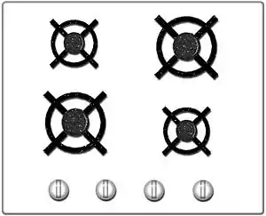
Consider, by way of example, the use of labelling on kitchen stoves with different arrangements of burners and controls.
Poor mapping: arbitrary arrangement of stove controls[5]

In the above case, an arbitrary arrangement of controls, such as controls in a row, even though the burners are arranged in a rectangle, thereby visually frustrating the inexperienced user, leading to a period of experimenting with the controls to become familiar with the proper usage, and potential danger to the user.[6]
Good mapping: full natural mapping of controls and burners[5]

Issues with the Stove metaphor: Moving to a theoretical understanding of Mapping
In the stove metaphor there is an illustration of placement in relation to the controls; however, the effect of the control in relation to its operation is Heat as a result of Rotation. Rotation does not naturally relate to heat, therefore the relationship is artificial, and a social construction. A better example would be the simple one of a privacy bolt on a toilet stall. A simple slide bolt with a knob has a very direct mapping, whereas, one with a rotating lever requires the understanding of the transformation of the rotation translated into the movement of the bolt horizontally. From this perspective, mapping is a characteristic of affordance. A deeper understanding of many our perceived 'natural' mapping relationships uncovers a predominately socially constructed, or cultural, underpinning, such as rotating a volume knob to make the music volume go 'up'.[7]
Car Seat Controls
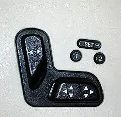
Consider the use of labeling car seat controls with the following two designs.
Poor mapping: arbitrary placement of controls with image labels
.jpg.webp)
In the above case, the placement of controls for adjusting the positioning of a car seat is extremely unintuitive. The intention behind the vertical and horizontal shaped controls are to reflect the movement of the seat; however, there is no indication to move the controls in the intended ways without referring to the image labels. This is a poor design because the controls are placed on the side of the seat, which is not visible to users when they are driving. Thus, the user must go through many trial and error attempts to figure out which control moves the seat forward, backward, upright, or laying flatter. There are also many other additional buttons that are arbitrarily placed next to one another with no tactile feedback on the controls themselves to indicate their functionalities.
Good mapping: miniature car seat display

In this example, the placement of controls for adjusting the positioning of a car seat is more intuitive and easier to use because the arrangement of controls directly mirrors the shape of a real car seat. This is especially useful during the process of driving when it is impossible to read the labels on the controls because the user can easily operate the controls without having much prior knowledge of each control's exact functionality. The bottom button clearly moves the bottom part of the seat forward of backward. The top button maps to the backrest of the car seat and dictates the vertical orientation of that part of the seat, moving it either more upright or flatter. This presentation of controls greatly aids the user in better understanding the state of the system and figuring out how to achieve their goal of adjusting their car seat to their liking without much cognitive strain.
References
- 1 2 Norman, Donald A., "Knowledge in the Head and in the World". The Design of Everyday Things. New York: Basic Book, 1988. 75
- ↑ Experience, World Leaders in Research-Based User. "The Two UX Gulfs: Evaluation and Execution". Nielsen Norman Group. Retrieved 2021-12-13.
{{cite web}}:|first=has generic name (help) - ↑ A Foundation For a perfect UI Design by CitrusBits (March 20, 2015)
- ↑ Norman, Donald A., "Knowledge in the Head and in the World". The Design of Everyday Things. New York: Basic Book, 1988. 78
- 1 2 Norman, Donald A., "Knowledge in the Head and in the World". The Design of Everyday Things. New York: Basic Book, 1988. 77
- ↑ “Don’t Get Burned by Bad Mapping” by Wayne Greenwood
- ↑ “Marshall McLuhan, Affordance, Mapping, and Human Computer Interaction in Interactive Media” by Robert Wellington
External links
- Publications by Donald Norman from Interaction-Design.org
- “Don’t Get Burned by Bad Mapping” by Wayne Greenwood