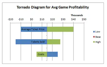
Tornado diagrams, also called tornado plots, tornado charts or butterfly charts, are a special type of Bar chart, where the data categories are listed vertically instead of the standard horizontal presentation, and the categories are ordered so that the largest bar appears at the top of the chart, the second largest appears second from the top, and so on. They are so named because the final chart visually resembles either one half of or a complete tornado.
Purpose
Tornado diagrams are useful for deterministic sensitivity analysis – comparing the relative importance of variables. For each variable/uncertainty considered, one needs estimates for what the low, base, and high outcomes would be. The sensitive variable is modeled as having an uncertain value while all other variables are held at baseline values (stable).[1] This allows testing the sensitivity/risk associated with one uncertainty/variable. For example, if a decision maker needs to visually compare 100 budgetary items, and wishes to identify the ten items one should focus on, it would be nearly impossible to do using a standard bar graph. In a tornado diagram of the budget items, the top ten bars would represent the items that contribute the most to the variability of the outcome, and therefore what the decision maker should focus on.
References
Further reading
- Technical note: constructing tornado diagrams with spreadsheets. Engineering Economist | June 22, 2006 | Eschenbach, Ted G