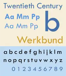
 | |
| Category | Sans-serif |
|---|---|
| Classification | Geometric |
| Designer(s) | Sol Hess |
| Foundry | Lanston Monotype |
| Design based on | Futura |
| Also known as | Airport, Tw Cen MT, Century Gothic (derivative) |
Twentieth Century is a geometric sans-serif typeface designed by Sol Hess for Lanston Monotype in 1937. It was created as a competitor to the successful Futura typeface for Monotype's hot metal typesetting system. Like Futura it has a single-story 'ɑ' and a straight 'j' with no bend.
A very large font family, Twentieth Century is particularly known for a limited range of styles being bundled with many Microsoft products such as Office.[1] Numerous other variants exist, including versions for very small text and an Art Deco-influenced titling capitals design, Twentieth Century Poster, with rounded capitals. In addition, Twentieth Century served as an inspiration for Century Gothic, designed by Monotype in 1991.
Casting history
The various weights and widths were cut over a period of ten years:
- Twentieth Century (1937)
- Twentieth Century Bold Italic (1937)
- Twentieth Century Extrabold Italic (1937)
- Twentieth Century Extrabold Condensed Italic (1938)
- Twentieth Century Ultrabold (1941)
- Twentieth Century Ultrabold Condensed (1944)
- Twentieth Century Medium Condensed Italic (1947)
- Twentieth Century Ultrabold Italic (1947)
Foundry type copies
The first American knock-off of Futura was Baltimore Type Foundry's Airport. No information exists on how this was produced, but it resembles Futura so closely, that it is thought to be electrotyped. After Monotype introduced Twentieth Century, Baltotype began selling some weights of this face under the Airport name.
Digital type copies
There presently exist two modern releases, by Monotype and Lanston Type (LTC). Monotype's current release is much larger than that included with Microsoft products, and includes additional light, semi-bold, extra- and ultra-bold styles.[2] Even less commonly seen are the quirky Art Deco-influenced display alphabet Twentieth Century Poster, intended to be complementary, and Twentieth Century Classified, a small print design with a very high x-height.[3] This veers away from the strict geometry of the main design, featuring a more conventional double-story ‘a’, presumably to be more legible. A similar design was offered by Linotype's Spartan, which may be an influence.[4] Lanston's design is in a narrower range of styles, but includes a set of additional stylistic alternates and small capitals.[5] LTC has also digitised other Hess sans-serif designs, such as Jefferson Gothic (a titling caps design similar to Twentieth Century Poster, but more condensed) and Tourist Gothic (an earlier grotesque design, to which Hess also added rounded caps).[6][7] Twentieth Century Poster has also been revived under the name as Renard Moderne by the company Nick's Fonts, a release that includes small capitals as a lower case.[8]
Digitisations of the original design are sometimes marketed as Tw Cen MT, possibly due to archaic file name length restrictions.
Footnotes
- ↑ "Installed files list for Office 2011". OfficeForMacHelp.com. Retrieved 14 June 2015.
- ↑ "Twentieth Century MT". MyFonts. Monotype. Retrieved 1 October 2015.
- ↑ "Twentieth Century Poster MT". MyFonts. Monotype. Retrieved 1 October 2015.
- ↑ "Twentieth Century". MyFonts. Monotype. Retrieved 14 June 2015.
- ↑ "LTC Twentieth Century". MyFonts. Monotype. Retrieved 14 June 2015.
- ↑ "LTC Jefferson Gothic". MyFonts. LTC. Retrieved 1 October 2015.
- ↑ "LTC Tourist Gothic". MyFonts. LTC. Retrieved 1 October 2015.
- ↑ Curtis, Nick. "Renard Moderne". MyFonts. Nick's Fonts. Retrieved 1 October 2015.
- ^ McGrew, Mac, American Metal Typefaces of the Twentieth Century, Oak Knoll Books, New Castle Delaware, 1993, ISBN 0-938768-34-4., p. 315.
- ^ McGrew, p. 9
- ^ Microsoft's description of Century Gothic
External links
- Specimen in original metal type
- Futura Alternatives - Stephen Coles' extremely broad round-up of it and other digital Futura competitors.