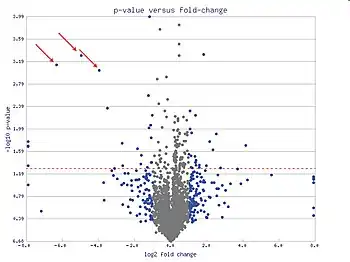
In statistics, a volcano plot is a type of scatter-plot that is used to quickly identify changes in large data sets composed of replicate data.[1][2] It plots significance versus fold-change on the y and x axes, respectively. These plots are increasingly common in omic experiments such as genomics, proteomics, and metabolomics where one often has a list of many thousands of replicate data points between two conditions and one wishes to quickly identify the most meaningful changes. A volcano plot combines a measure of statistical significance from a statistical test (e.g., a p value from an ANOVA model) with the magnitude of the change, enabling quick visual identification of those data-points (genes, etc.) that display large magnitude changes that are also statistically significant.
A volcano plot is constructed by plotting the negative logarithm of the p value on the y axis (usually base 10). This results in data points with low p values (highly significant) appearing toward the top of the plot. The x axis is the logarithm of the fold change between the two conditions. The logarithm of the fold change is used so that changes in both directions appear equidistant from the center. Plotting points in this way results in two regions of interest in the plot: those points that are found toward the top of the plot that are far to either the left- or right-hand sides. These represent values that display large magnitude fold changes (hence being left or right of center) as well as high statistical significance (hence being toward the top).
Additional information can be added by coloring the points according to a third dimension of data (such as signal intensity), but this is not uniformly employed. Volcano plots are also used to graphically display a significance analysis of microarrays (SAM) gene selection criterion, an example of regularization.[3]
The concept of volcano plot can be generalized to other applications, where the x axis is related to a measure of the strength of a statistical signal, and y axis is related to a measure of the statistical significance of the signal. For example, in a genetic association case-control study, such as Genome-wide association study, a point in a volcano plot represents a single-nucleotide polymorphism. Its x value can be the logarithm of the odds ratio and its y value can be -log10 of the p value from a Chi-square test or a Chi-square test statistic.[4]
Volcano plots show a characteristic upwards two arm shape because the x axis, i.e. the underlying log2-fold changes, are generally normal distribution whereas the y axis, the log10-p values, tend toward greater significance for fold-changes that deviate more strongly from zero. The density of the normal distribution takes the form
- .
So the of that is
and the negative is
which is a parabola whose arms reach upwards on the left and right sides. The upper bound of the data is one parabola and the lower bound is another parabola.
References
- ↑ Jin, W; Riley, RM; Wolfinger, RD; White, KP; Passador-Gurgel, G; Gibson, G (2001). "Contributions of sex, genotype and age to transcriptional variance in Drosophila melanogaster". Nature Genetics. 29 (4): 389–395. doi:10.1038/ng766. PMID 11726925. S2CID 16841881.
- ↑ Cui, X.; Churchill, G. A. (2003). "Statistical tests for differential expression in cDNA microarray experiments". Genome Biology. 4 (4): 210. doi:10.1186/gb-2003-4-4-210. PMC 154570. PMID 12702200.
- ↑ Li, W. (2012). "Volcano plots in analyzing differential expressions with mRNA microarrays". Journal of Bioinformatics and Computational Biology. 10 (6): 1231003. arXiv:1103.3434. doi:10.1142/S0219720012310038. PMID 23075208. S2CID 204899379.
- ↑ Li, W.; Freudenberg, J.; Suh, Y. J.; Yang, Y. (2014). "Using volcano plots and regularized-chi statistics in genetic association studies". Computational Biology and Chemistry. 48: 77–83. arXiv:1308.6245. doi:10.1016/j.compbiolchem.2013.02.003. PMID 23602812. S2CID 12399345.