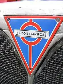
 Logo as used on bus radiator grilles[1] | |
| Product type | Public transport |
|---|---|
| Owner | Transport for London |
| Country | |
| Introduced | 1933 |
| Discontinued | 2000 |
| Related brands | London Underground |
| Markets | Greater London |
| Previous owners | 1933 - LPTB 1948 - LTE 1963 - LTB 1970 - LTE (GLC) 1984 - LRT |
| Registered as a trademark in | United Kingdom (29 August 1934)[2] |
London Transport (LT) was the public name and brand used by a series of public transport authorities in London, England, from 1933. Its most recognizable feature was the bar-and-circle 'roundel' logo. With its origins in the Underground Electric Railways Company of London (UERL), the brand was first used by the London Passenger Transport Board (LPTB) to unify the identity of the previously separately owned and managed London Underground, Metropolitan Railway, bus and tram services. The London Transport brand was extended under the direction of Frank Pick to all aspects of transport operation including poster designs, tickets, train livery, seat upholstery and the station architecture of Charles Holden. When public transport operation was taken over by Transport for London (TFL) from London Regional Transport (LRT) in 2000, the London Transport brand was discontinued and replaced with Transport for London's own branding, which incorporates many features of the London Transport brand including the 'roundel' symbol and the Johnston font.
History
Origins
Many aspects of the London Transport brand had their origins in the UERL. The bar-and-circle 'roundel' logo was first devised in 1908 and was used as part of the name boards at stations. The distinctive design, of a solid red circle and blue bar, enabled the station name to be easily identified.[3] Also in 1908 a consistent logotype was devised, which would later be adopted by LPTB. From the 1910s, the logotype and roundel started to be used together. The roundel was adapted in 1912, influenced by the logo of the London General Omnibus Company. The solid red circle was replaced with a disc and was registered as a trademark.[3] In 1913 Edward Johnston was commissioned to design a new common typeface. The dimensions of the roundel were standardised by the 1920s. Architect Charles Holden incorporated the roundel design into much of the station architecture of the 1920s and early 1930s.[4] The use of modern graphic posters to advertise public transport began in this period.
Adoption by LPTB
The LPTB initially devised its own brand and logo in 1933. This was almost immediately abandoned and the London Underground roundel was adapted for use by the authority under the new trading name London Transport.[5] The London Transport name was added to the logos devised for the trams and buses. In 1935 the bus stop 'flag' was redesigned and simplified by Hans Schleger to include the roundel outline; the design has remained broadly the same since. A standard signs manual was created during this period, codifying the design principles that had developed.
Brand development
In the post-war period the London Transport brand was passed to the nationalised London Transport Executive (LTE). The austerity of the period caused the authority to seek ways to reduce their manufacturing and maintenance costs; this led to new simplified designs.[5] In 1966 Bryce Beaumont became publicity officer and following his appointment a central marketing department was established. Basil Hooper was appointed as London Transport's group marketing director in 1974.[6] These changes led to an increased use of external agencies for publicity work, including the 1979 "Fly the Tube" campaign by Foote, Cone and Belding.[7]
Legacy
Control of public transport in London passed to Transport for London in 2000. The new organisation has continued the use of the roundel as its own logo and has extended its application to all areas of operation, including the Docklands Light Railway, Tramlink, taxis, and streets management. The roundel was also adapted for use on the London Overground services starting in 2007.[8]
See also
- Johnston (typeface)
- Oliver Green A leading author on the art and design of London Transport.
References
- ↑ Oliver Green & Sheila Taylor (2003). The moving metropolis: London's transport since 1800. Lawrence King.
- ↑ Intellectual Property Office. "Case details for Trade Mark 548799".
- 1 2 "History of the roundel". London Transport Museum. p. 1. Retrieved 20 September 2009.
- ↑ "History of the roundel". London Transport Museum. p. 2. Retrieved 20 September 2009.
- 1 2 "History of the roundel". London Transport Museum. p. 3. Retrieved 20 September 2009.
- ↑ "The age of agencies". Stories behind the collection. London Transport Museum. Retrieved 21 September 2009.
- ↑ "Fly the Tube, by Geoff Senior and agency Foote, Cone and Belding, 1979". Retrieved 21 September 2009.
- ↑ Steve Phillips (2007). "Underground... Overground". BBC London. Retrieved 20 September 2009.
External links
- London Transport (Archive)