| I Know...Brad | |
|---|---|
 | |
| Artist | Roy Lichtenstein |
| Year | 1964 |
| Movement | Pop art |
| Dimensions | 174 cm × 95.9 cm (68.5 in × 37.75 in) |
| Location | Ludwig Forum für Internationale Kunst[1], Aachen |
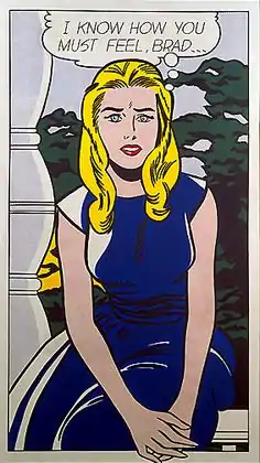
I Know...Brad (sometimes I Know How You Must Feel, Brad) is a 1964 pop art painting by Roy Lichtenstein that uses his classic Ben-Day dots and a speech balloon. The work is located at the Ludwig Forum für Internationale Kunst[1] in Aachen. It is an example of how Lichtenstein used his artistry to make significant changes to the original comics sources.
Background
Lichtenstein stated that the name Brad sounded heroic to him and was used with the aim of clichéd oversimplification.[2]
Background

_NGA.jpg.webp)
Measuring 174 cm × 95.9 cm (68.5 in × 37.75 in), I Know...Brad is considered an ironic depiction of emotional expression.[3] The work is a three-quarter-length, single image of a lovelorn girl.[4] This is one of Lichtenstein's post-1963 comics-based women that "...look hard, crisp, brittle, and uniformly modish in appearance, as if they all came out of the same pot of makeup."[5]
Details
According to a reproduction of Ellen H. Johnson's article entitled "Lichtenstein and the Printed Image" from Art and Artists (London, June 1966) the painting is somewhat removed from the original, while satirically mimicking several elements of it:
The slick black contours in I Know How You Must Feel, Brad wittily parody the crazy 'grace' of the pointed fingers, narrow wrist, swelling hips and breast and the flowing blonde hair of the comic. But for all the mannerism in Lichtenstein's American beauty (who numbers Ingres' Madame Moitessier among her ancestors), the total work is a powerful, commanding painting at least as far removed from the original comic as Seurat's paintings are from Chéret's posters.
— Sources, [6]
Johnson notes how Lichtenstein transforms the comic inspiration not only by enlarging the scale, but he also by eliminating non-essential details such as fingernails and traces of forearm musculature. In addition, by varying and reducing the number of lines he presents a better depiction of their character. His color change makes the work more dynamic and the subject more idealized. He also makes the landscape background more robust.[6] Lichtenstein stated that the name Brad sounded heroic to him and was used with the aim of clichéd oversimplification.[7] The work presents an "...unmistakeable acknowledgement to the flamboyant linearism of Art Nouveau...".[8]
See also
Notes
- 1 2 "View In Museums – Roy Lichtenstein Foundation". Roy Lichtenstein Foundation. Retrieved January 3, 2018.
- ↑ Coplans, p. 110.
- ↑ Archer, Michael (2002). "The Real and its Objects". Art Since 1960 (second ed.). Thames & Hudson. p. 14. ISBN 0-500-20351-2.
His paintings looked, at first glance as mechanically fashioned as their source material, although it is evident in a painting such as I Know How You Must Feel, Brad (1963) that the idea of art as an emotionally expressive activity is being ironically considered..
- ↑ Coplans (ed.). Roy Lichtenstein. p. 41.
Generally, the earlier the imagery the less significant the degree of crop: Girl at Piano (1962) and I Know...Brad (1963) are both three-quarter-length, single images of lovelorn girls situated within different settings.
- ↑ Coplans, p. 23.
- 1 2 Boatto, Alberto and Giordano Falzoni (ed.). Lichtenstein (International ed.). Fantazaria. p. 108.
Eliminating inessentials, he dispenses with finger-nails and forearm muscle indications, cuts the number of lines throughout and more tellingly states and varies their curved or angular character. He changes the colours and gives them more force (from a dull red to a bright blue in the dress, from dirty yellow to brilliant gold in the hair), thus further idealising the ideal girl of the comics; he intensifies the range and contrast of values; makes the flabby landscape background into a jagged expressive pattern; transforms the vague rocket-like shape on the left into a neat vertical column...
- ↑ Coplans (ed.). Roy Lichtenstein. p. 110.
Well, I had the idea of 'The Hero' Brad. 'Brad' sounded like a hero to me, so all heroes were to be called Brad—a very minor idea, but it has to do with oversimplification and cliché.
- ↑ Pierre, José (1977). An Illustrated History of Pop Art. Eyre Methuen. p. 94. ISBN 0-413-38370-9.
...the three outstanding successes: I Know…Brad, Hopeless and Drowning Girl, in which we recognize an unmistakeable acknowledgement to the flamboyant linearism of Art Nouveau.
References
- Coplans, John, ed. (1972). Roy Lichtenstein. Praeger Publishers.